Tag Archives: Color

An Accidental Re-do

Standard

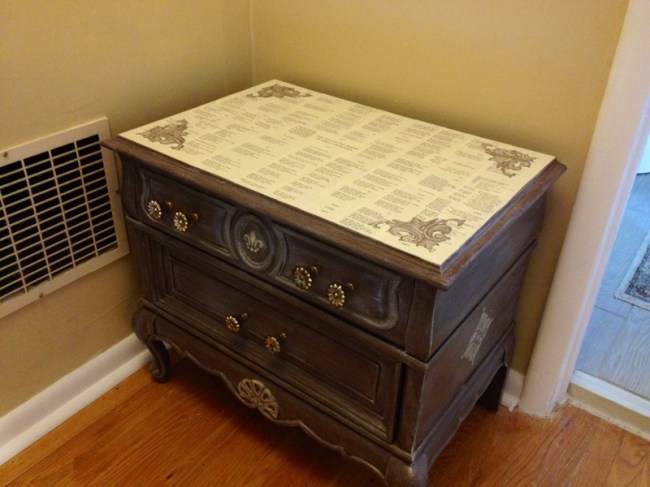
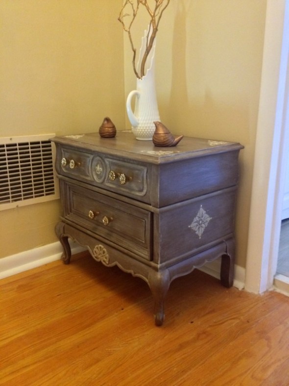
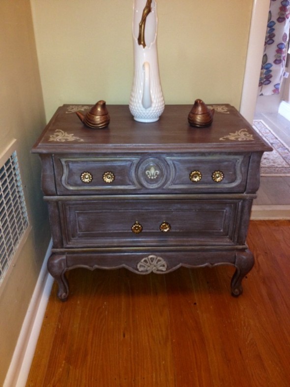
On Wednesday, we had an electrician come over to do some work for us upstairs. My newly-redone hall table was right outside the main bathroom. I always try to provide water, coffee, or beer to anyone working on the house. Hubby set the glass of ice water on the table. Despite layers of poly and wax, the water bubbled the top layer and it peeled RIGHT off the table.


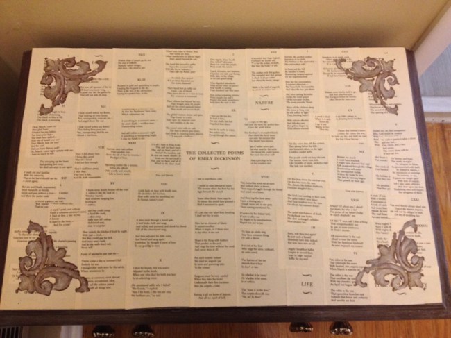
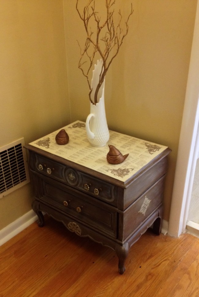
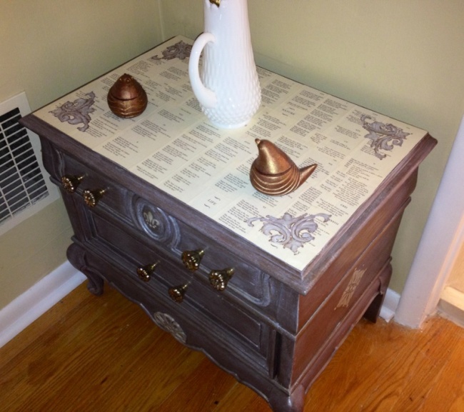
-_- Do you know how long those paint jobs take? They’re not something you can patch up! I allowed myself my momentary freakout and went back to the drawing board. The best idea I had for the top was to decoupage it. Emily Dickinson is one of my favorite poets, so I put her poetry on the top, using lots of regular glue, reinforcing the seams, and 3-4 heavy coats of poly. I added the side stencils and then hand painted the undertones of white and gold, sealing it when done. No need to worry about this finish coming off!


Not a bad save, I (actually) like something I did 🙂

Cost: Free (doesn’t get better than that).

ImageImageImageImage


If you’re a lover of the unrivaled, devastating beauty of words (as I am), familiarize yourself with Emily Dickinson. No one will ever surpass Robert Frost for me, but she’s way up there. Some of my favorites:


I had no time to hate, because
The grave would hinder me,
And life was not so ample I
Could finish enmity.

Nor had I time to love, but since
Some industry must be,
The little toil of love, I thought,
Was large enough for me.

~~~~~~~~~~~~~~~~~~~~~~~~~~~~~~~~~
Hope is the thing with feathers
That perches in the soul,
And sings the tune without the words,
And never stops at all,

And sweetest in the gale is heard;
And sore must be the storm
That could abash the little bird
That kept so many warm.

I've heard it in the chillest land,
And on the strangest sea;
Yet, never, in extremity,
It asked a crumb of me.
~~~~~~~~~~~~~~~~~~~~~~~~~~~~~~~~~

Behind Me — dips Eternity –

Before Me — Immortality –

Myself — the Term between –

~~~~~~~~~~~~~~~~~~~~~~~~~~~~~

And of course, my all-time favorite of hers:


If I can stop one heart from breaking,

I shall not live in vain;

If I can ease one life the aching,

Or cool one pain,

Or help one fainting robin

Unto his nest again,

I shall not live in vain.

– Emily Dickinson


em Oh: I "met" my new classroom 2 days ago, and we like each other very much :-) I look at it as my next blank canvas. From now on, I want my room to reflect me and I have to put my stamp on it. I'm already dreaming of projects for it, some are already in the works. I'm feeling so much more inspired and happy lately. I love this photo only because it radiates that. Here I am in my new future "second home"! class Lastly, this is unrelated and I know "Throwback Thursday" is a Facebook thing... But I came across this photo of my 6th grade class trip. Seeing the Twin Towers is always eerie, moving, and incredibly sad. I remembered being so awed by their massive size. trip

French & Sensibility

Standard

(See what I did there, bibliophiles and Jane Austen fans?!)

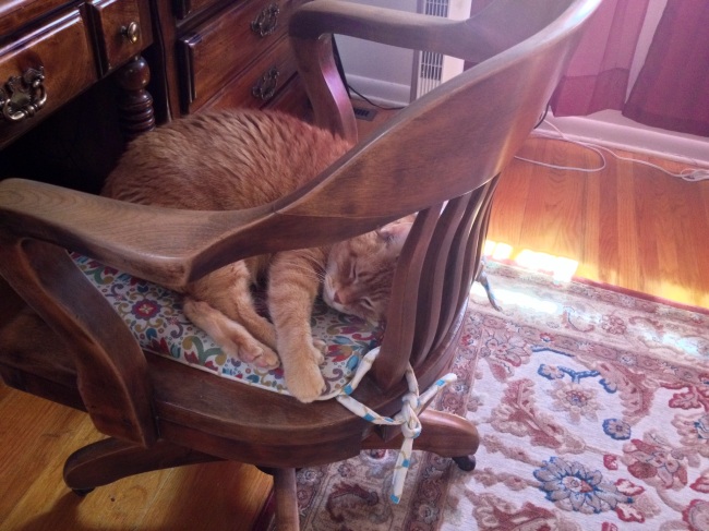
For the record, I came up here to the office to blog, and was greeted with this:

Image

After coaxing him off with treats, I’m ready to go 🙂

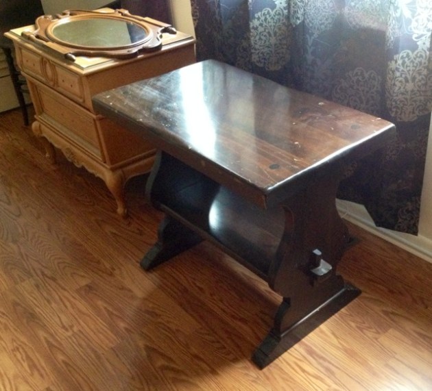
I’ve got TWO projects to blog today 🙂 I’ll start with showing you the raw materials and starting costs. I found an awesome, thick pine trestle bench/end table at a thrift store. It was $7 and I had to have it! It was rustic and yet reminded me vaguely of a church pew.

The second piece is a nightstand that I got for free from one of my upcycle friends. I threw my back out getting it to my car, as it apparently is the heaviest nightstand on earth. The drawers were very swollen from the humidity and it needed a little work, but my goodness…those lines and details! I knew it would really be something when completed.

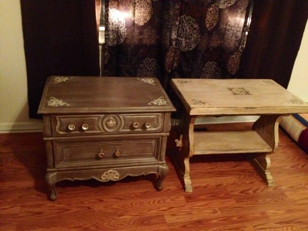
Here are my two “before” items:

Image

(ignore the mirror. That’s something I am making pretty and into a chalkboard for my classroom).

See? Great lines and tons of potential on both.

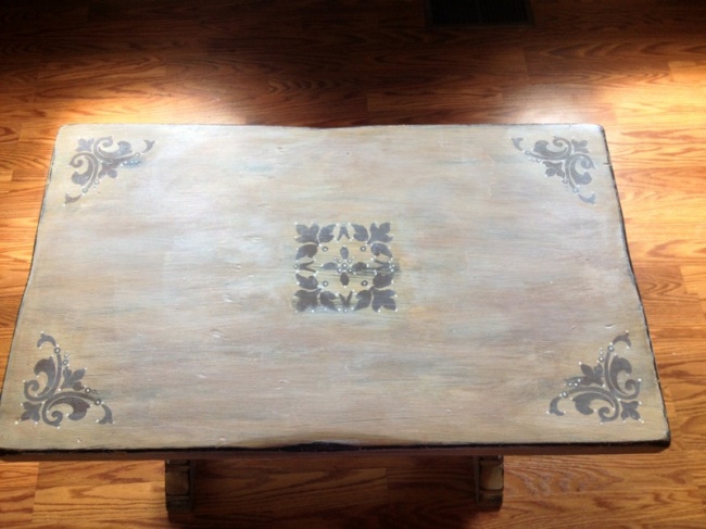
I was not feeling bright or loud colors for these two beauties. I did, however, know I wanted to play around with stencils. I decided on a driftwood/sand color for the trestle table and a deep metallic grey/brown for the nightstand.

First up, the trestle table!

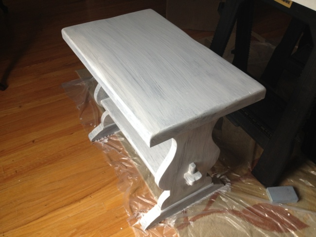
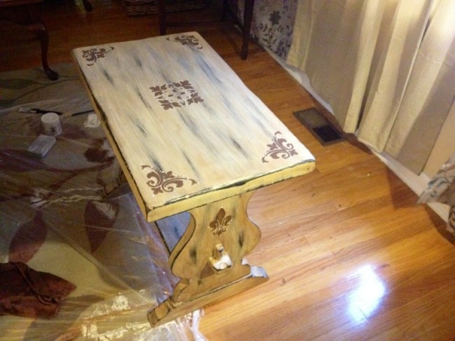
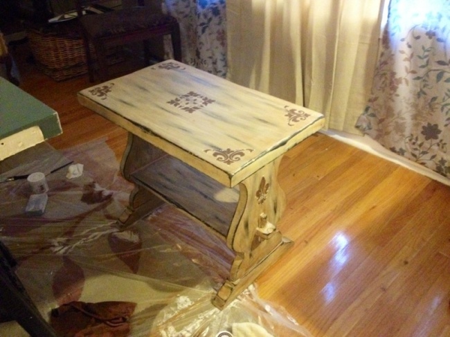
I painted the whole piece in white shabby paint, and then roughed it up heavily. In order to get the color I wanted, I used a dark antiquing wax, which gave me that pretty shade I wanted. I found stencils I really liked that gave the piece a French vibe and stenciled the designs on in darker brown. Here’s the first coat to paint:

Image

Here’s the “after” waxing and stenciling:

ImageImage


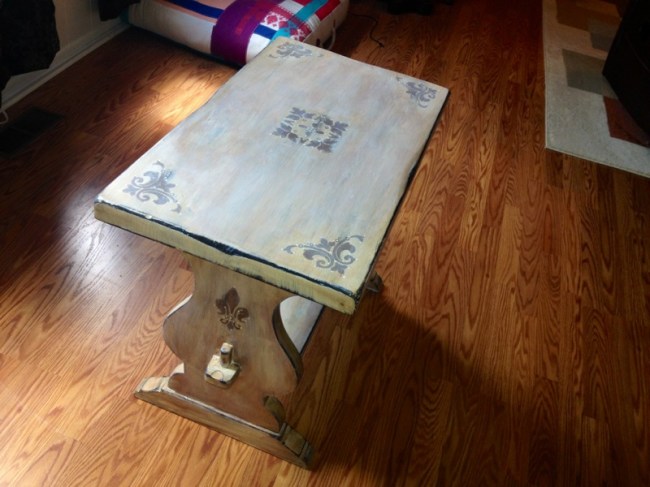
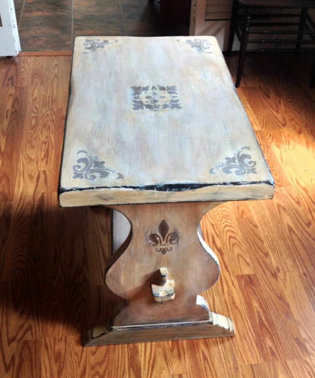
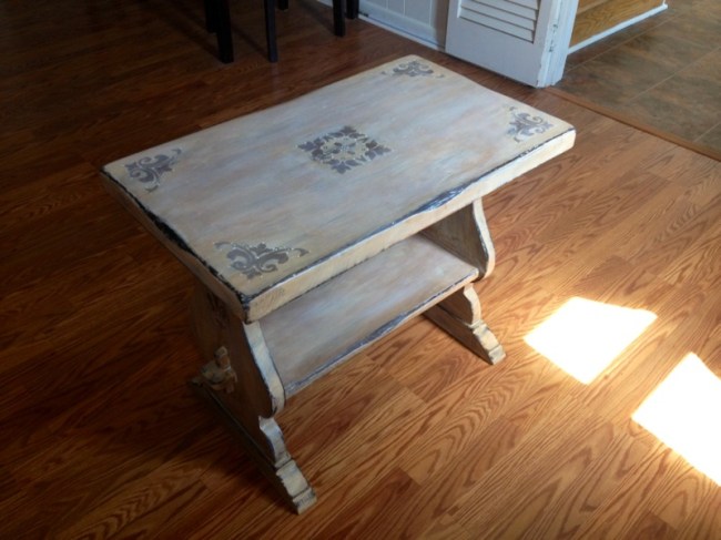
It was finished here, technically. After looking at it again the following day, I wanted to tweak it, because I thought it was too distressed and I found the pattern of sanding distracting. After redoing pieces of it and then using white revax (varnish and wax) on it, I finally got my desired result:

Image

Image

Image

Image

SO happy with it now. I love it. How people overlook things like this, I will NEVER comprehend!


Now for piece #2, the freebie nightstand:

After a few days inside my house in the AC and some sanding along the drawer edges, the drawers worked again. It had no pulls, so I needed to tackle that too.

I decided that in order to achieve the color I was going for, I’d need a deep brown base in a flat color and a white top glaze.

For white glaze, I recently tried a product called white revax and it’s AMAZING! Seriously, it seals, protects, and glazes all at once. A little goes a long way and it’s something to keep on hand for any future projects. It’s also non-toxic, VOC free, and made in the USA (does it get any better than that?) You can read about it and buy it here:

https://shabbypaints.com/vax-revax/

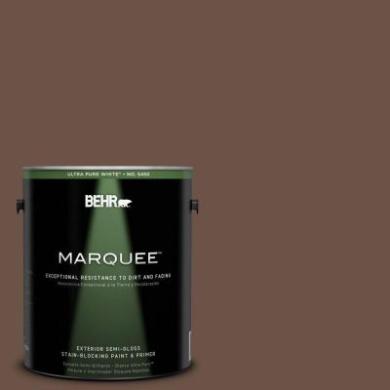
For my base color, I went to Home Depot and chose a color from Behr’s Marquee line called “Well-Bred Brown”:

Image


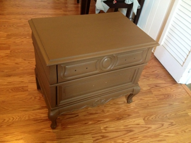
Let me tell you, this paint is un-freaking-believable. It goes on like butter! I definitely recommend this line, notable for its stain and dirt resistance. Here is the nightstand after its base coat:

Image

Looks just like melted Hershey’s milk chocolate bars. Exactly the shade I was going for!

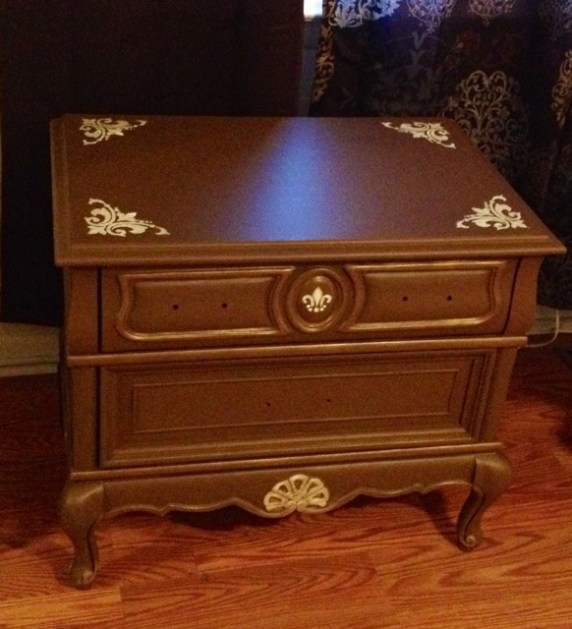
After this stage, I played around with the stencils and got this result:

Image

I love the corner flourishes, and had to put a tiny fleur-de-lis on there on the front. The design at the bottom I painted by hand to bring it out. I accented the stenciled parts with a small hint of metallic gold acrylic paint.

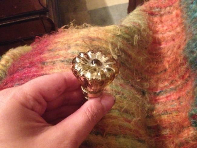
I actually nixed drawer pulls in favor of knobs, despite the fact that pulls likely “go” better for the piece. I found just what I wanted at Anthropologie…gold, vintage-looking mercury glass knobs on clearance for $2.95 each. Perfect!

Image

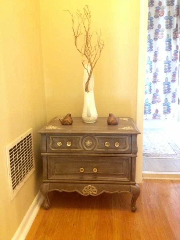
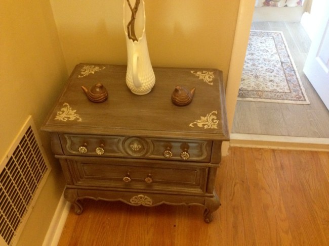
After sealing the brown paint with water-based poly, it was time to glaze it 🙂 After using the revax and adding my knobs, the job was done. Prepare for the photo blitz and cue “Isn’t She Lovely”:

Image

Image

Image

Image

Image


SO HAPPY WITH IT! The brown with the white revax gave me just the color I wanted.  slightly metallic grey-meets-brown. Love, love, love. Times a million.


Now for costs!

Project #1:

Trestle table: $7

Stencils: $2.40

Paints/sanding block/materials: Already on hand.

Total cost: $9.40


Project #2:

Nightstand: Free (thanks, Kelley!)

Sample can of Behr Marquee “Well-Bred Brown”: $3.94

Stencils: $2.40

Knobs: $2.95 each x 6 for a total of $17.70

Other poly/materials/brushes/revax: Already on hand.

Total: $24.04


How’s THAT for bargains?! I love them both and am so digging the French-inspired style lately. My ottoman makeover (previously blogged) bit me with the Parisian bug. So, see? All you need is some vision, and everything old becomes new again!


Til next time…


Roadside Rescue Makeover: ANOTHER Chair!

Standard

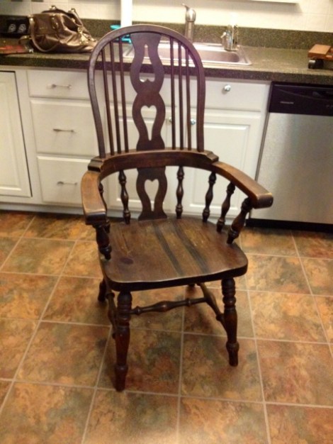
En route home the other night, my husband noticed (mere nanoseconds before I did) 2 chairs and a dining table at the curb by our neighborhood. I can spot quality a mile away, and what caught my eye first was a beautiful table base, country-looking and trestle-style. I typically get eye-rolls, loud sighs, and joking divorce threats when bringing salvaged furniture into my life/home, so I was shocked when he willingly turned the car around to look! There was a BEAUTIFUL, thick, high-quality dark pine dining table with two chairs. The chairs were lovely, with a finely-detailed Windsor design that was rustic and yet elegant. I needed one (naturally).


Whoever went home with the dining table is a lucky person indeed!


Shocker #2 was when my husband said “I think we can fit both in the car”. I had to make sure I heard him right! Being practical, I said we should take the better of the two chairs. So we went home with this beauty:Image


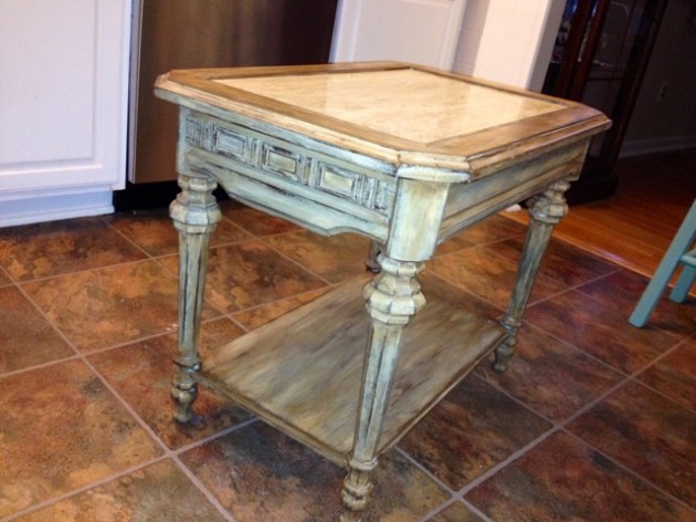
Oh, the potential! I do not like to refinish dark pine, and prefer painting it (not my usual). Looking at the details, I decided on a shabby paint job, but was torn between an oatmeal shade with antiquing wax like this $3 thrift store table makeover (I did this last week):

Image

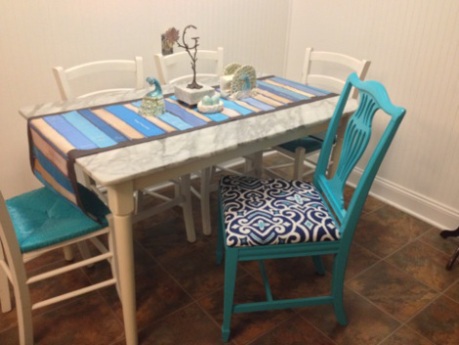
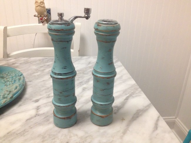
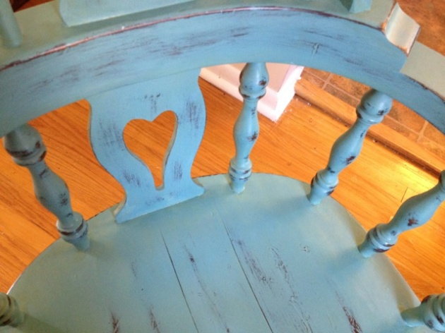
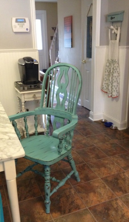
OR this robin’s egg blue shade that I used to make over my $0.50 salt and pepper mills:Image


The blue idea won out, mainly because it’s the final chair I could get away with squeezing into the hodgepodge/ quirky eat-in area! It’s softer than the screaming turquoise I used on the other chairs and I’ve been all about blue lately! That, and I had plenty of the paint left over, so I did not need to buy any supplies!

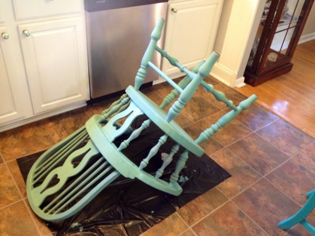
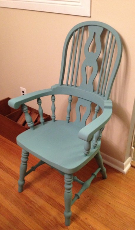
Here she is after being painted with the blue chalk paint:

ImageImage


See? Pretty even without being shabbied up!


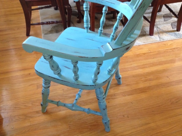
After I took a sanding block to her, this was the result:


ImageImage


I had no clear furniture wax left, so in an effort to keep this project completely free, I used some semi-gloss water-based poly I had left over from the floors. I used this to seal it, since it would be expecting frequent use.


This was a TOTALLY free project! Free chair, leftover paint and poly, leftover paint brushes and sandpaper. It doesn’t get better than that!

Here it is in its “home”:

Image

Bonjour, Paris! (A fast, easy, cheap little makeover)

Standard

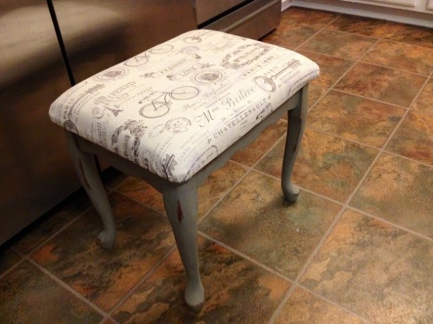
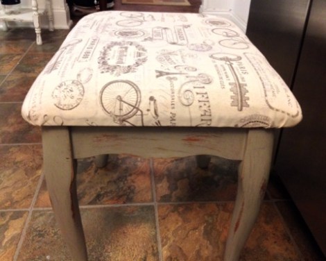
When I saw a small ottoman/upholstered footstool for sale for $5, all wood with padding and plywood intact…I pounced! There’s no limit to what could be done with it. It’s funny to me that the makeover ended up being neutral, demure, and sophisticated rather than vibrant, bright, and fun.


I’m fairly certain the culprit is “The Other Boleyn Girl”, which I am currently re-reading for the fourth time. Maybe it’s the sense of artistocracy, Anne’s French sense of fashion, or the courtly revels, but I’ve had Paris on the brain today.


I decided I wanted to budget between $8-$10 total for the project, including the ottoman and supplies.


Well, $3 in fabric later (I had also bought a burlap fabric, but it didn’t “fit” as well as this cotton twill), leftover chalk paint and paint supplies later, and I had my final result!

I used a bit of semi-gloss water-based floor poly to seal the chalk paint, which I distressed using an old sanding block. When keeping project costs down, GO SHOPPING IN YOUR OWN HOUSE.


Seriously…it’s the best way to do it! And chalk paint is environmentally friendly, non-toxic, and safe, so it’s a good choice for virtually anyone. Roughing it up is a lot of fun, and you can play around with it to achieve your desired result.

I did one good coat of oatmeal colored chalk paint and then roughed it up.


Here is what I started with:

Image

Bad fabric, bad color (it did not know whether to be maple or mahogany). However, good bones!

Here’s the frame after paint and before distressing:

Image


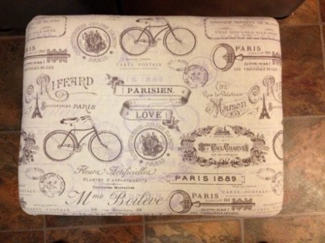
And the final results:ImageImageImageImageImageImage

(That last photo, with the flash on, highlights the distressing).

I fell in love with that fabric straight away…old bikes, skeleton keys, French script, the Eiffel Tower? AND cheap? Sign me up! It is a cotton twill, as previously mentioned, not heavy tapestry or thick fabric, but it works perfectly on this piece. I’ll use my $2 piece of Parisian burlap for another project in the future.


So to recap costs:

Footstool/ottoman: $5

Parisian fabric: $3

Leftover paint, brushes, poly, sanding block: FREE 🙂

Project total: $8


Here it is in its new home, next to a fabulous $15 overstuffed chair that I got on Craigslist last summer. The butterfly pillow is from Pier 1 and features French script that pairs nicely with the ottoman.

IMG_1568

Can’t beat that, can you?

Image

Image


Until next time 😉

Somewhere Under the Rainbow (and over the bulkhead)

Standard

Ho-kay! So…

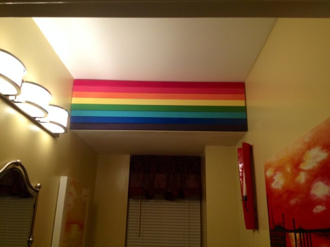
I won’t even mince words. I have done a LOT of cool things to my house since I bought it in 2013. I’m not sure why this little, silly, eccentric change is such a big deal to me, but it is! Like all great ideas, it began as a tiny ghost of a thought that snowballed and spiraled into something totally different…and far more wonderful.

The original plan was a pallet wall in the half bath, with rustic, unfinished wood. Then, I thought that maybe I should also put the pallet wood on the bulkhead where the main pipe is stored in the ceiling. Then I got to thinking I could salvage some of the pallet planks and paint them bright rainbow colors on the bulkhead. THEN, after taking the idea to my husband, he suggested scrapping the pallet wood and going for a more streamlined look with 1 x 2’s painted and placed together.

I’ve always been in love with (and truth be told, kind of obsessed with) rainbows. What’s not to love?! I am a colorful person, I love color in my house, I love all the things rainbows mean and stand for, and they simply make me happy. Once the idea of having my own, personal rainbow in my own home took hold in my mind, I couldn’t let it go.

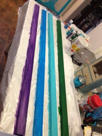
I searched high and low, but could not find any photos of exactly what I wanted or planned on doing. Either it hasn’t been done or (more likely) simply hasn’t been posted. But this little bulkhead was the perfect place for a small but brilliant makeover. I decided early on to follow the ROYGBV color scheme, but after hubby had measured the bulkhead, he said that to sit the colors/lumber boards all up against one another, it was going to require 8 colors! After some thought (and a lot of mixing of paint), I decided to add a terra-cotta color after the red (that matched the half-bath perfectly) and a cross between robin’s egg blue and turquoise after green, for a total of 8 colors. Because the boards were pre-primed, my job was easy! I bought acrylic paints rather than latex for this project. The hardest part was spending the time to mix colors to make them exactly, perfectly “right”.

Here’s the top half of the rainbow being painted:

ImageImage

And the top half of the rainbow all finished:

Image

::warm fuzzies::

(Looks like a sunset!)

Then, it came time to begin the bottom half:

Image

(that was after coat 1)

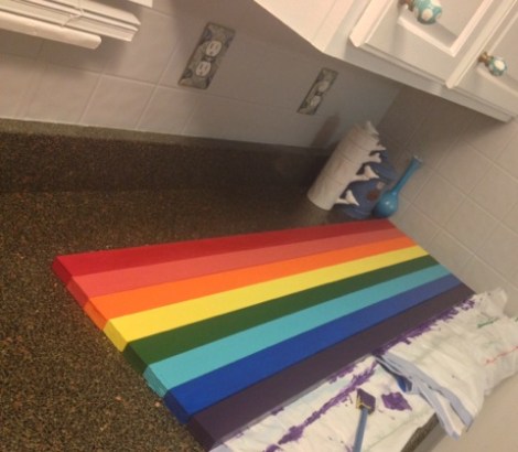
After a few other coats, here is the whole rainbow assembled together:

Image

Now, let’s play “spot the problem”.

SEE THAT GREEN?! EEK. Way too dark! After several tries mixing to get the color I was going for:

Image

That’s more like it!

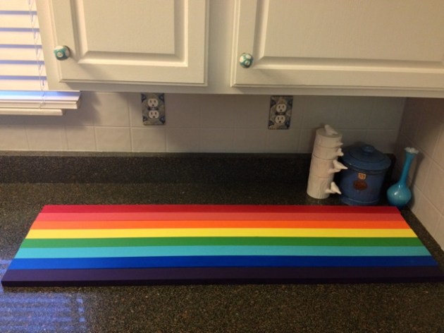
Once more, here it is with all of the finalized colors:

Image


And ::drumroll, please:: Here is the completed accent wall, up on the bulkhead in the half-bath.

Image

Image


I realize that to a lot of people, I am the layman’s term for “crazy”. However, I love my rainbow accent wall and I love that I have my own rainbow at home.

One of the best parts? Between materials and paint, the whole cost of the accent wall was a mere $15! If this isn’t $15 of fun, I don’t know what is 🙂

A Touch of Retro (Paging the 1950’s!)

Standard

Hello, my precious little blog! I’ve missed this place. I’ve also missed having, you know…a life.

I’m always really inspired in the summertime, when I’ve got vacations on the brain and plenty of time to myself to get creative!

In the interest of beating the wintertime blues (as NJ has spontaneously morphed into an offshoot of Antarctica), I want to talk retro, I want to talk kitchens, and I want to talk 1950′s design elements. *cue Julie Andrews singing “My Favorite Things”*

They say style is cyclical. “They” are right! It seems that every number of years, things come back into vogue again. Maybe it’s just me, but I feel I am seeing this constantly with the 1950′s! ESPECIALLY when it comes to kitchens, so much of what is popular right now harkens back to this time period. I super-love the decor/design of the 50′s…from fashion to home design. I also have to say that while I did not set out or plan to add some 1950′s elements to my kitchen during the remodel, it definitely ended up that way.

Let’s go back in time a bit. I’m going to show you some ads and photos of 50′s kitchens so we have a baseline to work with:
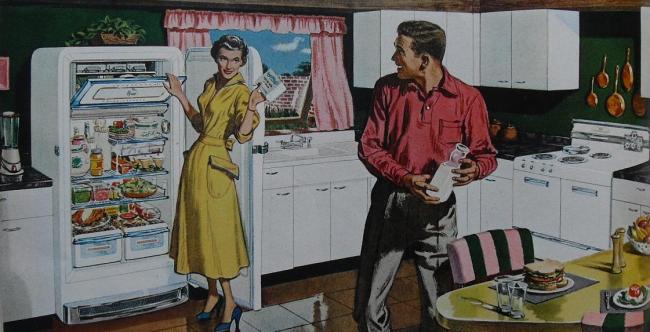
Image

Ahhh yes, the 50′s “kitchenbitch”. A true classic. What I find intriguing is the crisp, white look. This kitchen would not look out-of-place in a kitchen today!
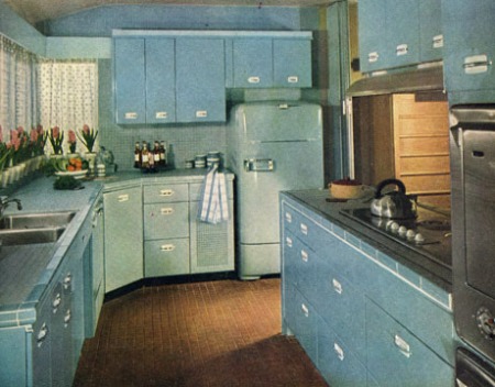
Image

I can’t tell you enough how much I adore this kitchen. the 50′s saw the rise of metal cabinets in fun colors, such as this Tiffany blue. The fridge just brings it all together. Look on the right and you’ll see the awesome stainless steel wall ovens…which are highly desirable right now.
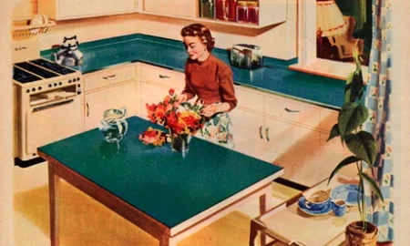
Image

Another “white cabinet” kitchen….this time with tea/green formica counters and an island *very trendy back then*.
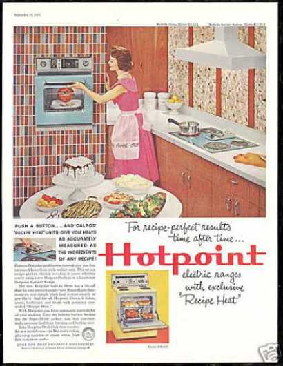
Image

50′s “Hotpoint” ad featuring their colorful wall oven. My obsession with the color aside, they are coming back in popularity. Notice something else? Check out the mosaic wall design. Flip the pattern horizontally and you have today’s tile backsplash. I always fly into an unnecessary rage when people buy an old kitchen with an awesome old wall oven and then RIP IT OUT. WHY?!
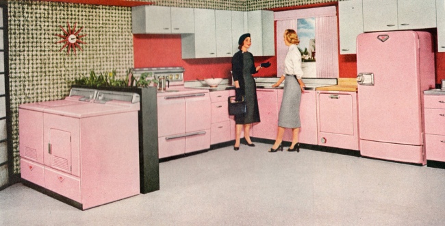
Image

1950′s “pepto pink”. A true classic. Also popular in bathrooms and tile. Hey, this was the housewife’s domain, and if she wanted a pink kitchen, she got one!
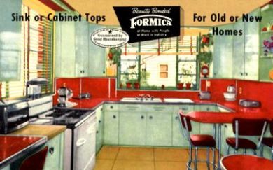
Image

This is an old Formica ad. It was the fashionable thing to have. Formica actually grew to NOT be a trend, as it was the go-to material for countertops for 50+ years! Today, most people want natural stone or some form of cement/silestone. What I also think is fun about the ad is that it features the great “retro red” pop of color so popular in this day (carried over from the 40′s).
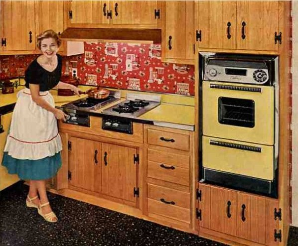
Image

Changing gears, this ad focuses on yellow accents (Formica and wall oven) but features wood cabinets with the classic 50′s hinges and hardware. Sweet wallpaper, no? *yikes*

When you really start to examine the photos, you can’t help but see eerie similarities to what is trending today! Every decade has its moment in the proverbial sun and its own particular nostalgia. However, something about the 50′s seem a little more lasting (and somehow still relevant).

Fast forward to 2014: A kitchen remodel is the most expensive (and sought after) home renovation. The trouble is that they’re so costly! To completely rebuilt a basic kitchen will easily cost you $30,000. A remodel on the higher end usually tops $50,000. I’ve discussed kitchens a few times before.This entry is more for those who don’t WANT to spend a small fortune, but if you’ve got a big budget, you can work with this information, too!

If you want something other than beige granite, stainless steel appliances, travertine backsplash, and darker wood cabinets…consider bringing one or more 50′s elements into your kitchen! You can do it in a big way or do it in a more subtle fashion. I personally feel it’s the most fun with color added, but hey…your call.

Whether you bought an older home and are working with what you have, or want your newer kitchen to travel back in time, here are some awesome renovated kitchens with elements borrowed from the 50′s:
Image

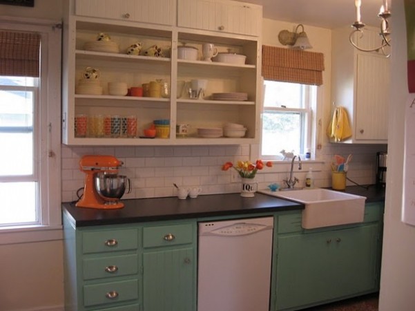
The above kitchen is the stuff of my vintage fantasies! I love the painted cabinets, the hardware, the apron sink, and the removed cabinets on top to make room for open shelving that houses fun, colorful accents. The white subway tile backsplash keeps it simple but fits perfectly, and the white appliances are a perfect choice here. How much fun is that orange Kitchenaid?! These people get an A+++ from me! They took an older kitchen and redid it in a way that stays true to the era but *belongs* today, too.
Image

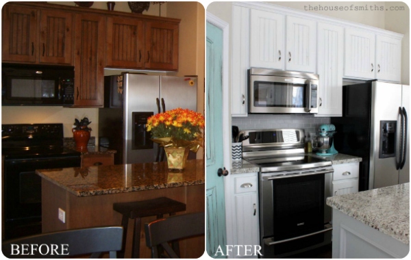
Now, you may notice that the “before” photo is the “everykitchen” that is sought after today. It’s tasteful, it’s pretty, but it’s also rather anonymous. I love these people for their excellent and MUCH more fun “re-vamp”! They added shiny new stainless appliances (which are somehow a perfect modern-retro marriage), painted the cabinets white, chanegd the hardware to stainless steel, and (my favorite change), chalk-and-distress painted their pantry door. GENIUS! Perfect vintage touch! What is striking is how different the granite looks after the re-do…it’s the same counter-top, but the white, bright remodel changes its look.
Image

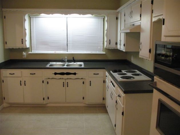
Talk about preservation! These homeowners did a gorgeous job preserving the style and integrity of their 50′s kitchen while still creating something stylish and relevant. They kept and painted their original hardware and exposed hinges. They painted the original wood cabinets off-white. They kept their still-working wall ovens and old gas cooktop. The scallop details that frame the window are pretty and unique. The best thing they did was paint their old counters to an awesome matte black that “fits” perfectly. A re-vamp like this costs nearly nothing!

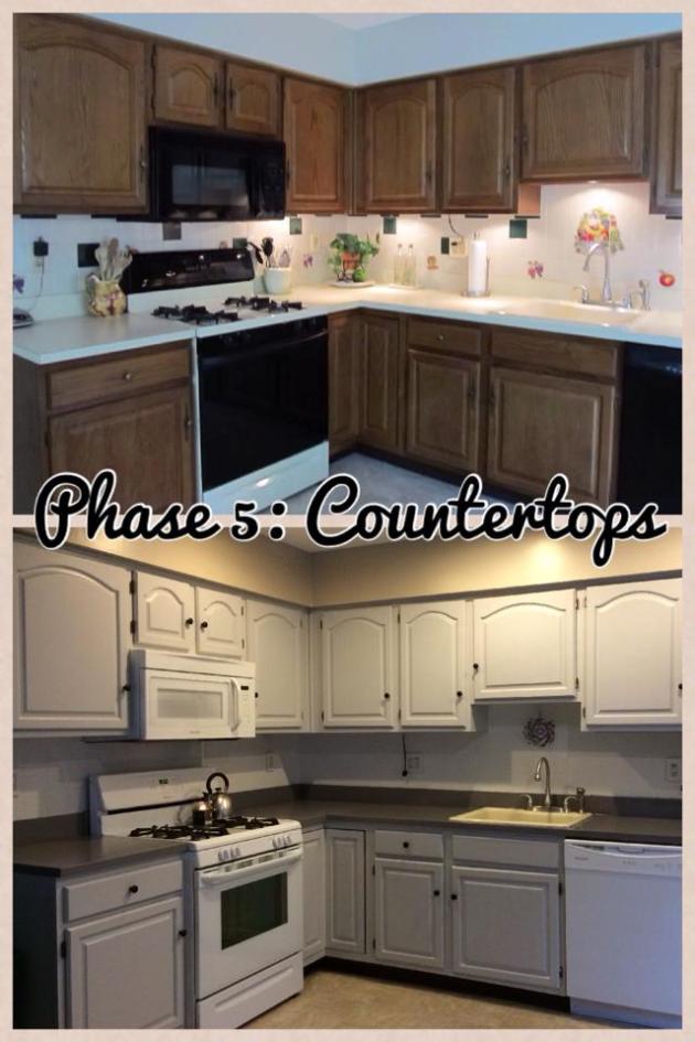
I want to feature the kitchen of a friend of mine (hi Kristen!), because she is a perfect example of the amazing transformation that countertop-painting can bring about!
Image

I’m 100% being honest when I say I don’t think I have ever seen such a huge transformation for so little money. You may wonder what this has to do with “retro”? The elements are there in a subtle way, with the brightened cabinets and brand-new, glossy white appliances (white/glossy was big in the 50′s, as it looked crisp and clean). It looked awesome before she painted the counters, but painting them completed it all. It took time and elbow grease, but her “I may as well try it, anything is better than what I have” attitude paid off! The resulting lovely shade of grey is the perfect complement to her shiny new appliances and grey cabinets. The kitchen has taken on a more “French country” feel. Let this photo stand as a testament to the fact that a kitchen that looks completely different needn’t break the bank. If you have bad, ugly, or old countertops but don’t want to shell out thousands right now for new ones, get your paint on (make sure to seal it afterwards). You can go classic and elegant like Kristen did, or try out a fun pop of color. The best part? If you don’t like it, try another color :-) There are also countertop-refinishing/refacing kits you can buy specifically for this type of project.

Back to more 50′s/vintage inspiration:
Image

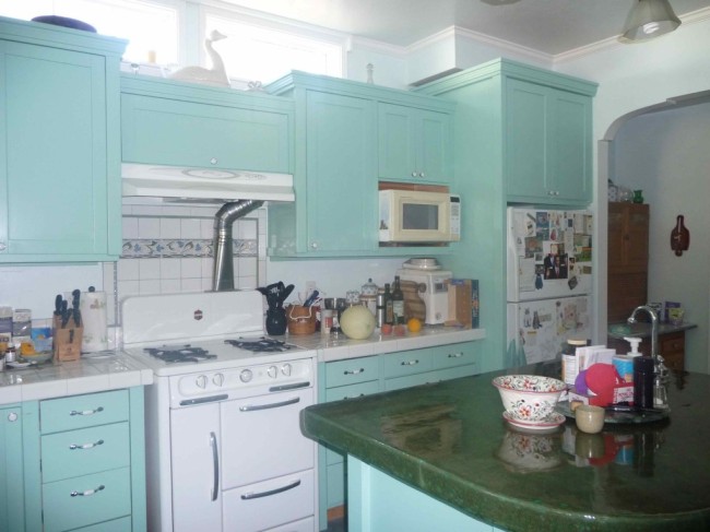
These homeowners painted their old wood cabinets while keeping an original retro stove and backplash. They painted their island and left the green enamel top as-is. Not a fan of that, but hey…it works for them. The biggest problem in this kitchen is THE CLUTTER THAT MAKES MY BRAIN EXPLODE and the yellowed, cream microwave. That should be white, and this kitchen needs a good “organize”, because it’s otherwise charming.

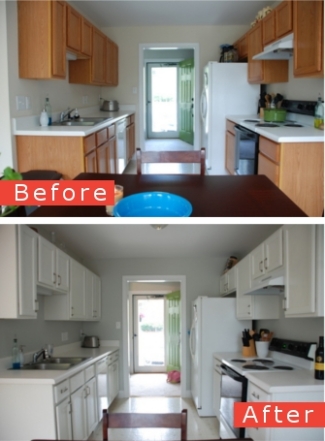
Here’s just an example of how brightening up your kitchen space can take your layout from “wind tunnel” to “fresh, clean, and open”:
Image

Their goldenrod accessories are a nice pop of color, too!

If you’re not doing an actual reno but want to add in a few fun 50′s elements, consider doing so with accessories! I’ve done some of this in my own kitchen and will add a few more soon.

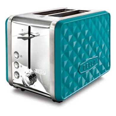
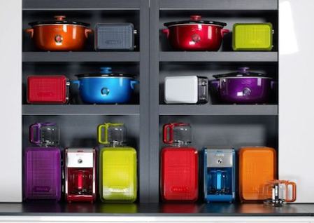
The Bella company makes cooking/kitchen appliances in excellent colors with a vintage-feel:

ImageImage

(I am thinking of buying that toaster for my own kitchen. This line is affordable and accessible).
Image

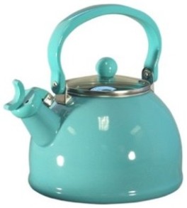
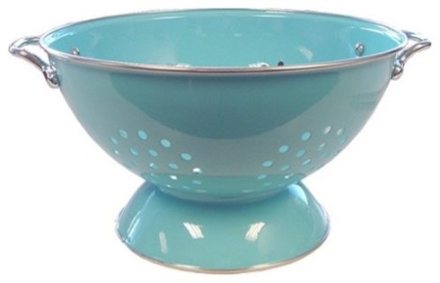
Another current trend is accessories that feel nostalgic:
ImageImageImage

(I am clearly partial to aqua blue. Please excuse my blatant bias!)

Appliances that feel vintage are gaining in popularity:
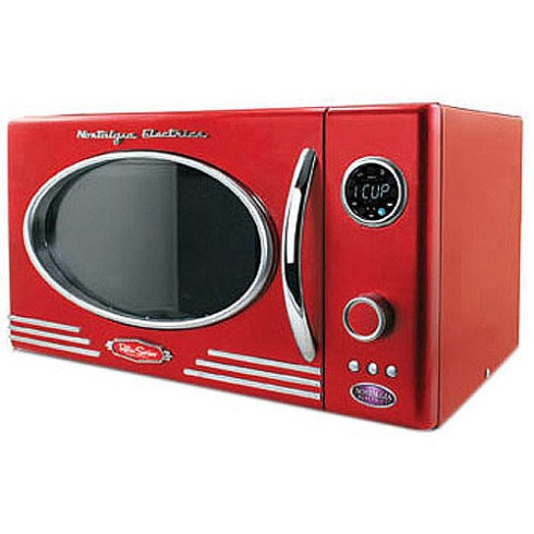
Image

Fantastic microwave by Nostalgia Electrics.
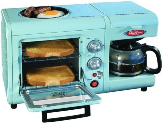
Image

How. Freaking. Genius. It’s literally a breakfast station…coffee, toast, and eggs/meat on the top griddle. All wrapped up in an inexpensive and whimsical package.

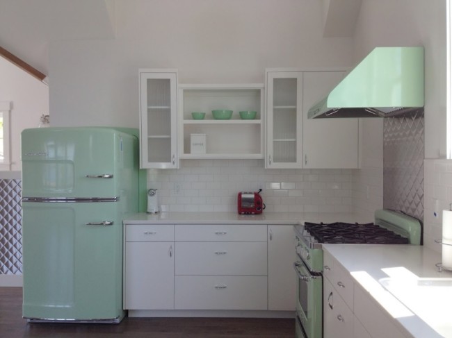
If you’ve got VERY deep pockets, you can outfit a kitchen in brand-new appliances that look vintage…by Big Chill:
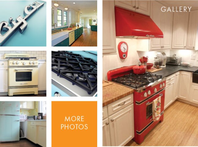
Image

Image

(I adore the mint green!)

They’ll set you back $3,000 for the fridge, $4,000+ for the range, $600 for the microwave, $1,700 for the dishwasher, $1,400 for a vent hood, and $3,000 if you choose a wall oven. They are STUNNING, but my goodness…the prices raise my blood-pressure!

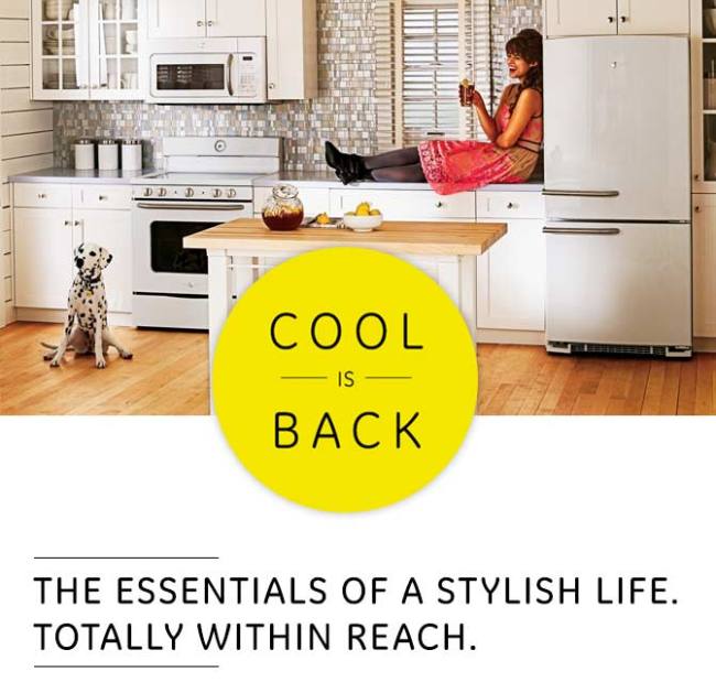
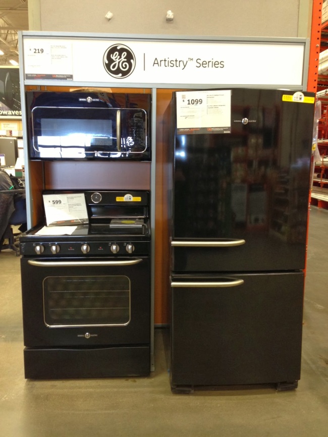
If you want affordable nostalgia, GE designed a line called “Artistry” which features a choice of black or white appliances that have a 50′s feel for VERY little money…you can easily get the whole kitchen full of appliances for about $2,000-$2,200, which is great!
Image

Image

Image

I fully admit that if I was not set on stainless for the look I wanted, I’d have bought these in white, hands-down, no-contest.

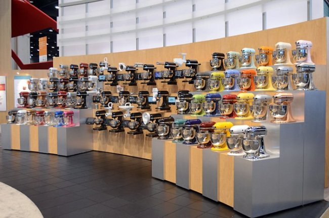
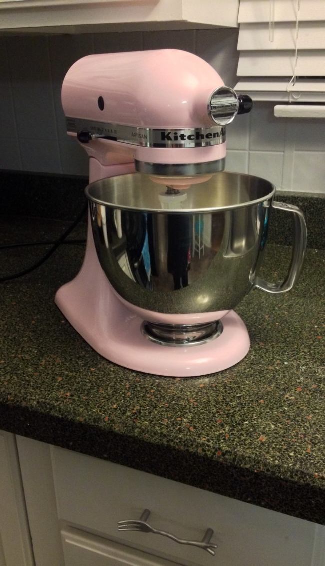
Another easy way to add a vintage element is with a colorful and endlessly useful Kitchenaid mixer!
Image

Image

My hubby bought me this pale pink breast-cancer edition mixer…I named her “Loretta”:

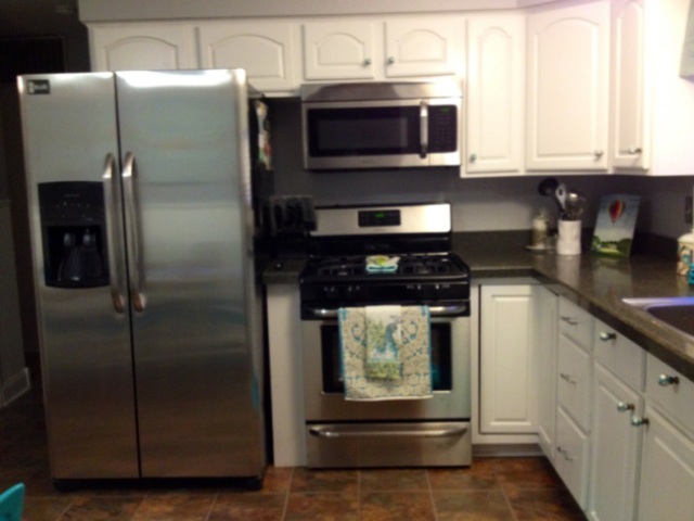
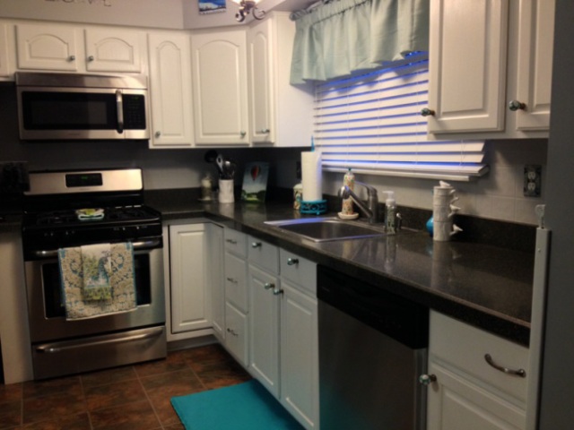
In conclusion, don’t shy away from playing around with 50′s elements in your kitchen, because the results can be inspiring and fabulous! Remember that it doesn’t take a lot of money to DIY a kitchen from something cringeworthy to something you’re proud to show off. I’ve ALWAYS loved the style of the 1950′s…all my life. I did not realize I was going in that direction when we re-did our kitchen, but the end-result clearly shows a lean to vintage/retro. I leave you with a reminder of my kitchen “before and after”, that cost us a measly $2,500:
Image

Image

Now for our “accidental-50′s-inspired” after:
Image

Image

Image

Don’t be afraid to play around with style! Do what inspires you and makes you happy, while remembering that there’s always room for 1950′s charm in some element or another. Until next time…

Light, bright, and white…Kitchen edition!

Standard

When we got our house, our kitchen had extremely good “bones”. It is a nice size, there is a good amount of storage, the seller put “Granite Transformations” counters in (granite fabricated to lay over your existing counter), and there is a stainless steel sink with a fabulous faucet. The floor is a slate laminate that is newer and in great shape.

All in all, not bad and definitely workable!

Here were the downsides:

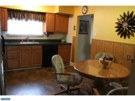
1.) Walls that were so 1973 mustard yellow that looking at them actually hurt my eyes.

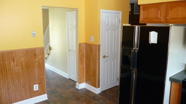
2.) Dated appliances (the 1991 black fridge with creme sides and an old dishwasher that I don’t think has that much “juice” left in it). I will say that I have a fairly new black Whirpool gas range that is very nice!

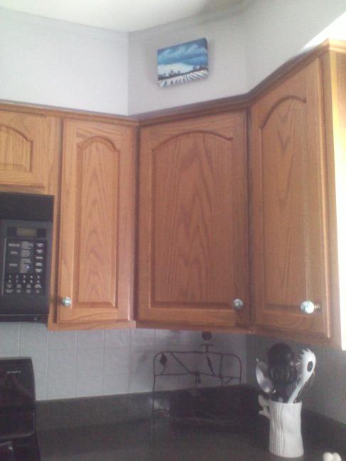
3.) Oak cabinets with bright gold brass knobs. I don’t like the color of the oak, but will say that these are extremely high quality cabinets that probably cost a ton of money originally. All joints are dovetailed, the craftsmanship is excellent.

4.) An absolutely hideous “backsplash” of shiny, textured linoleum tile with tan flower bouquets on some of them.

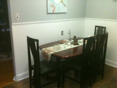
5.) Weird, unpainted beadboard in a knotty-wood design.

It just looked really, really dated. And too dark!!! There was way too much wood and it didn’t feel cheery at all (despite the blazing yellow). And it was totally missing what is really important to me…

Whimsy! Where was the element of fun, the touch of the unique? Nowhere to be found!

So as always, here are some “before” photos for you to cringe at:

ImageImageImageImage

See what I mean? Good bones, bad choices. Dated, dated, dated.

I am a “warm tones” person through-and-through! Warm colors feel homey, comfy, and inviting to me. Despite this, for whatever reason, I have always dreamed of a white kitchen!

Before tackling the cabinets and the beadboard, I freaked out one day and couldn’t take the yellow anymore. Jeff and I picked out our paint and the color we went with was Olympic’s “Secret Passage”. We got to work painting the kitchen right away(which was a very challenging room to paint, by the way).

The end result was a color that is my favorite color in the house! To say I love it would be a major understatement. It is a thousand times better, and I no longer want to shove bamboo shoots in my eyes every time I enter my  kitchen.

Here is what our kitchen looked like after we painted:ImageImage

HUGE improvement!

To keep the proverbial ball rolling right along, we decided to paint the beadboard white as our next kitchen project. We had some leftover bonding primer from the den and leftover trim paint from the baseboards and trim on the stairs. Here was the result:Image

It already looks like a different room! Notice my owl switchplate cover (I named her “Hedwig, naturally), the outlet cover that is gorgeous but too small in the photo to see, the bird print, the brass “G” monogram tree centerpiece, the runner, and the 3 small tree stumps wrapped in twine. In earlier photos you will notice the aqua blue and white knobs that look like Super Mario turtle shells. Remember earlier when I said the kitchen needed some whimsy? That’s what I meant.

After this, we were planning to wait a while to do our cabinets, but in the Greenberg household, that seems to translate to “next week”. Hah!

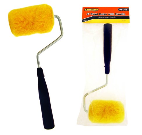
So we went for it! We first got clean cloth and wiped down all of the cabinets with mineral spirits to dull the lacquer and give the paint a better surface to adhere to. With our trusty Valspar bonding primer, we gave the outside of the cabinets 2 coats and the inside of the doors got 1. We chose semi-gloss paint (nice and easy to scrub), and the color was Behr’s “Snow Drift” so that it was a little softer than straight trim paint. We did them while hung, but most people remove the cabinets and hardware. We took off the knobs and taped over the hinges. We found that tiny 4-inch rollers and 2 inch trim brushes (with a tiny brush for details) were all that we needed to give the cabinets a smooth, non-streaky finish. The small rollers really did an amazing job making an even finish, while the trim brushed filled in the grooves where the roller could not reach. Here’s a photo of what you need:Image

Let me note that you CAN get spray paint. You can find a special paint made for wood and cabinets, but be aware that this is a pricier option (though also easier). Our goal was “as cheap as possible”, so we chose the traditional paint method.

Now for the most fun part…the results, the transformation, the “WOW” factor that white gives a kitchen. You will never believe it’s the same room:

And

Here

We

Go

ImageImageImage

(Last one is blurred due to the natural sunlight coming in, sorry about that).

WOW, WOW, WOW, RIGHT?!

It does not look like the same space! We are ecstatic about it. It’s bright, light, cheery, and feels even larger. Talk about doing it on a shoestring budget! This “update” was as cheap as it gets.

All right, now for…

The cost comparison:

DIY: $100 for materials that include bonding primer, paint, and supplies.

Professional: A good ballpark estimate for refinishing cabinets is about $2,000. There is a very slight chance it would be lower, but it’s more likely to be even higher.

The future for our kitchen holds:

1.) Stainless appliances.

2.) A glass mosaic tile backsplash.

3.) The wall knocked down to open it to the dining room, leaving a small partition to hold a custom-made island that is both table for 4 and prep/storage space. THIS will not come cheap. We can do most of the demo ourselves, but we will need a professional to move electrical work and finish it off perfectly. My contractor will build me the island, white finished hardwood with a large granite or cement top.

4.) Perhaps furthest into the future, a new floor. My heart is currently set on good wood laminate that looks like driftwood. If not, I will likely go for a medium-colored Pergo. I am not a fan of tile, so laminate it is!

My very fervent hope is that we can get all of the above for between $5,000-6,000, and that is all the money I ever want to put into the kitchen. Compared to what most homeowners spend on kitchen remodels, this is ridiculously cheap. I think we can do it!

But for right now and while money is tight, I love my kitchen.