Brace yourselves and buckle up, because this is going to be a long one! SO much time and effort went into this nursery for my daughter, not to mention blood, sweat, and tears (I literally thought my back was going to snap in half at one point).
We found out the night before the first day of school back in early September that we were expecting. At this time, our daughter was nothing more than a faint pink line on a test!
To start at the beginning, I have to go back to July. As soon as we decided to let “whatever happens happen”, the notorious planner and prepper in me got to work right away! Children had never really been in my life’s plan, so I never allowed myself to imagine things like what our nursery would look like. I started looking online for ideas and found details I liked, but nothing that was right. I scoured thrift stores and Craigslist and my taste began to take shape. When I found what I loved, I pounced without thinking, knowing in my usual style that it would come together in the end. Boy or girl, I knew I wanted to work with a lot of what I had in the guest room, that I wanted my favorite neutrals (khaki/beige, warm white, shabby blue) to be the color scheme. As for a theme, I wanted a shabby cottage type of look with a subtle beachy vibe (that part got stronger as time went on). There are adorable nurseries full of ruffles, pink, blue, cars, and monsters…but none of those specific themes felt right. We knew we would opt to learn our baby’s gender, but we knew that neutral for me would never come in the form of yellows and greens (which frankly, I can’t stand).
As I searched and got a feel for what I gravitated towards, I came across one set of baby bedding in particular. Once I laid eyes on it, it was all I could think about. I had a visceral reaction to it and felt like it was designed for me. Knowing nothing about baby brands, I did my research….and almost passed out! I must have a good eye, because I had set my sights on Glenna Jean’s “Central Park” collection. Glenna Jean is the priciest baby bedding on the market, heirloom quality, made in the USA, designer, the whole nine. Not only were the colors exactly what I envisioned, it had the spirit of an heirloom quilt and the most wonderful textured accents. The set and accessories I wanted also came in at a steep $567. YIKES!!! Here’s my “love at first sight” set:
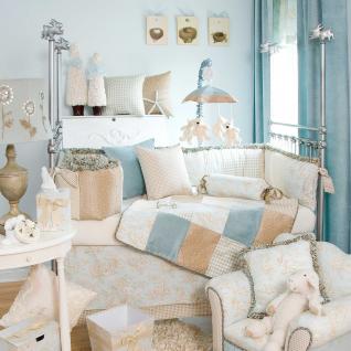
See? Serene, calm, cottage-esque, neutral, vintage-inspired.
I came to terms with the fact that I would never be able to afford that. About a week later, I nearly fainted when I saw a listing pop up on Craigslist for none other than the baby bedding of my dreams, in mint condition…for $40. Yes, you read that correctly. We were in the car and picking it up that same morning. It was all the bedding, a mobile, a diaper stacker, changing pad cover, etc. Score!
Next up was finding a crib! I knew I wanted white (no dark wood for me) and that I preferred a more modern style or a vintage-inspired Jenny Lind style. I found one I adored on a yard sale site, but it lacked the shabby feel I wanted. The fix? Jeff and I had a great time taking it out back in pieces and taking the power sander to it to distress it. An added bonus is that we now have a great memory to go with it. It was a BRU brand crib by Baby Cache. Ones extremely similar to it on the site now sell for between $350-$500. We paid just $80 for a crib 2 years old!
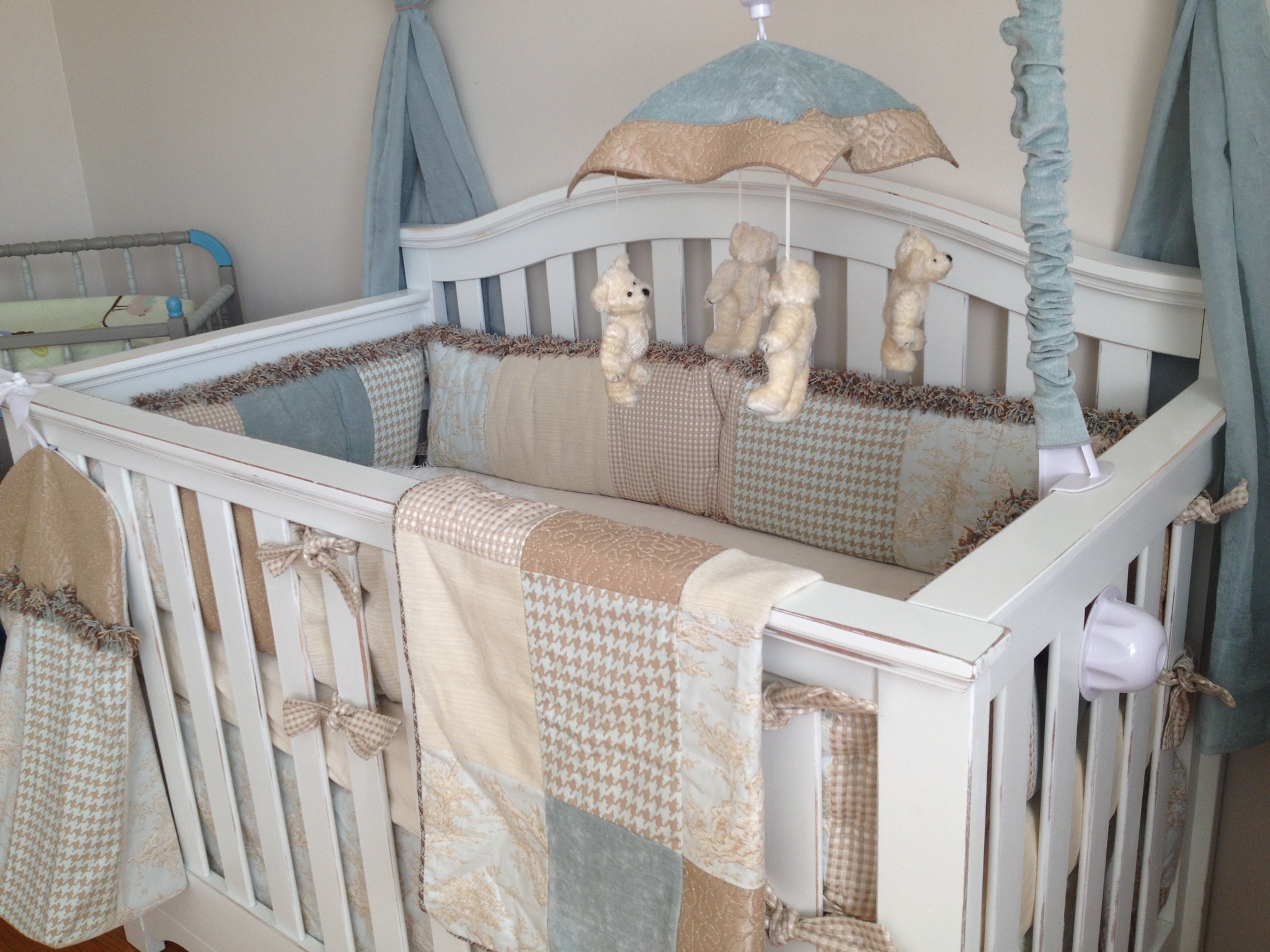
We snagged a Colgate brand baby mattress in great shape for $10 to go with the crib. Some say don’t buy used, I say find one in excellent shape and go for it.
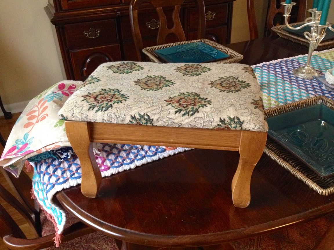
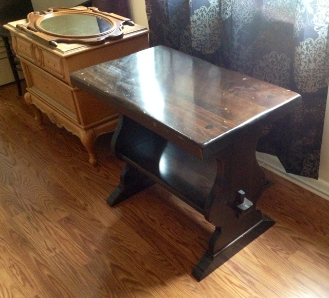
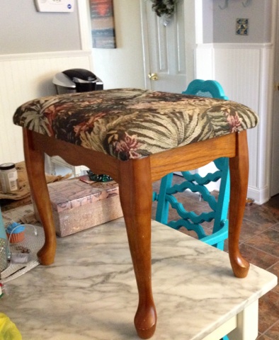
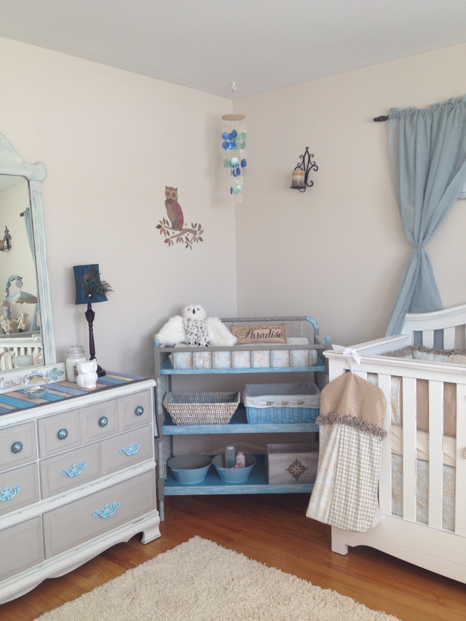
A changing table? I didn’t like the new ones I was seeing. The lines were off, and nothing felt right. Then, a friend had a vintage, spindle-style (the Jenny Lind lines I love) changing table to trade me for a child’s bench I found. Cost? Free! All I did was take it from this:

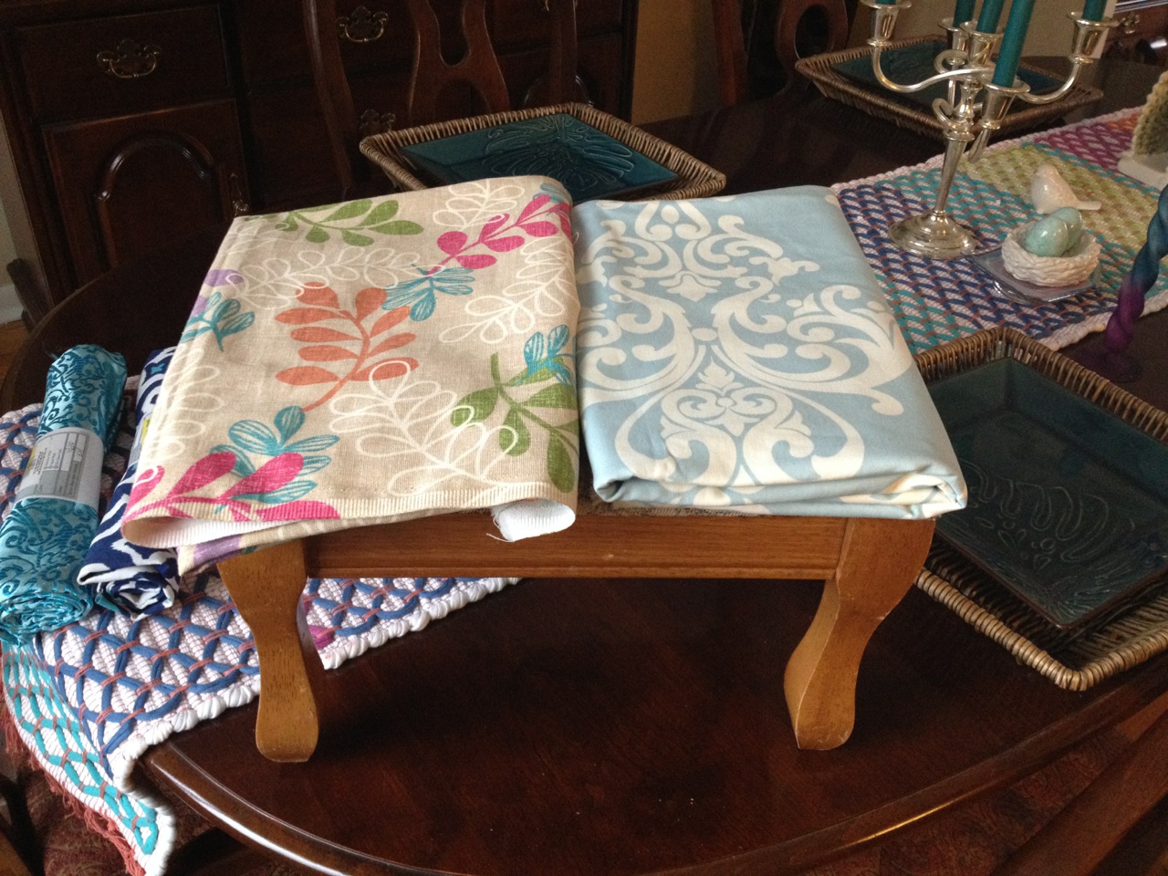
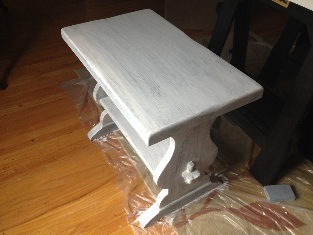
to this:
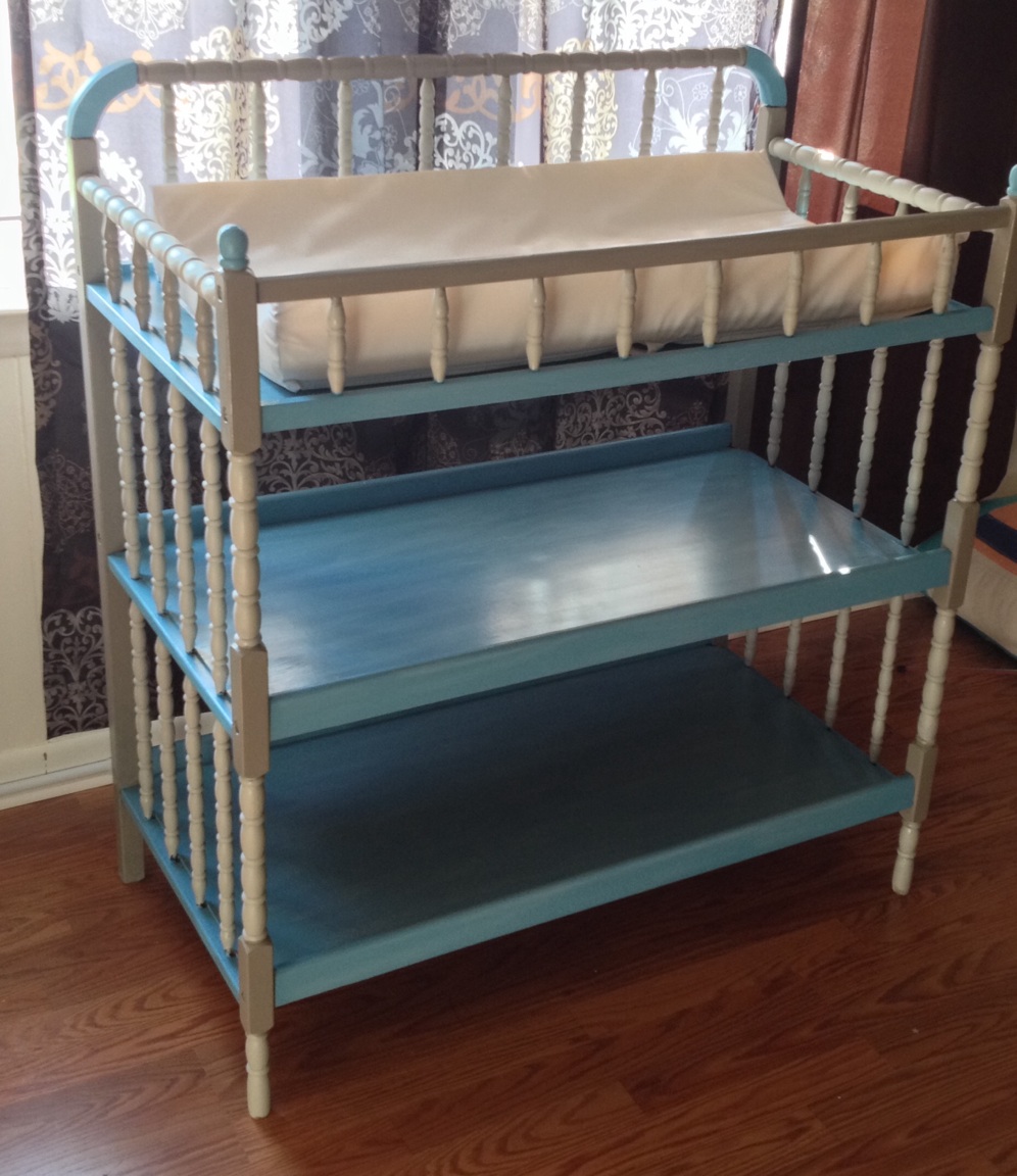
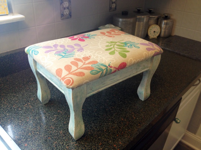
To this:
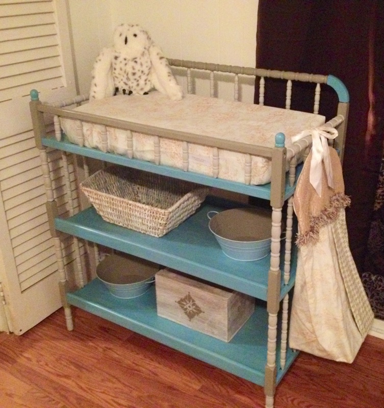
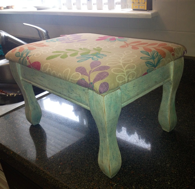
And now, finally, with some shabbying up and tweaks…this (its final incarnation)
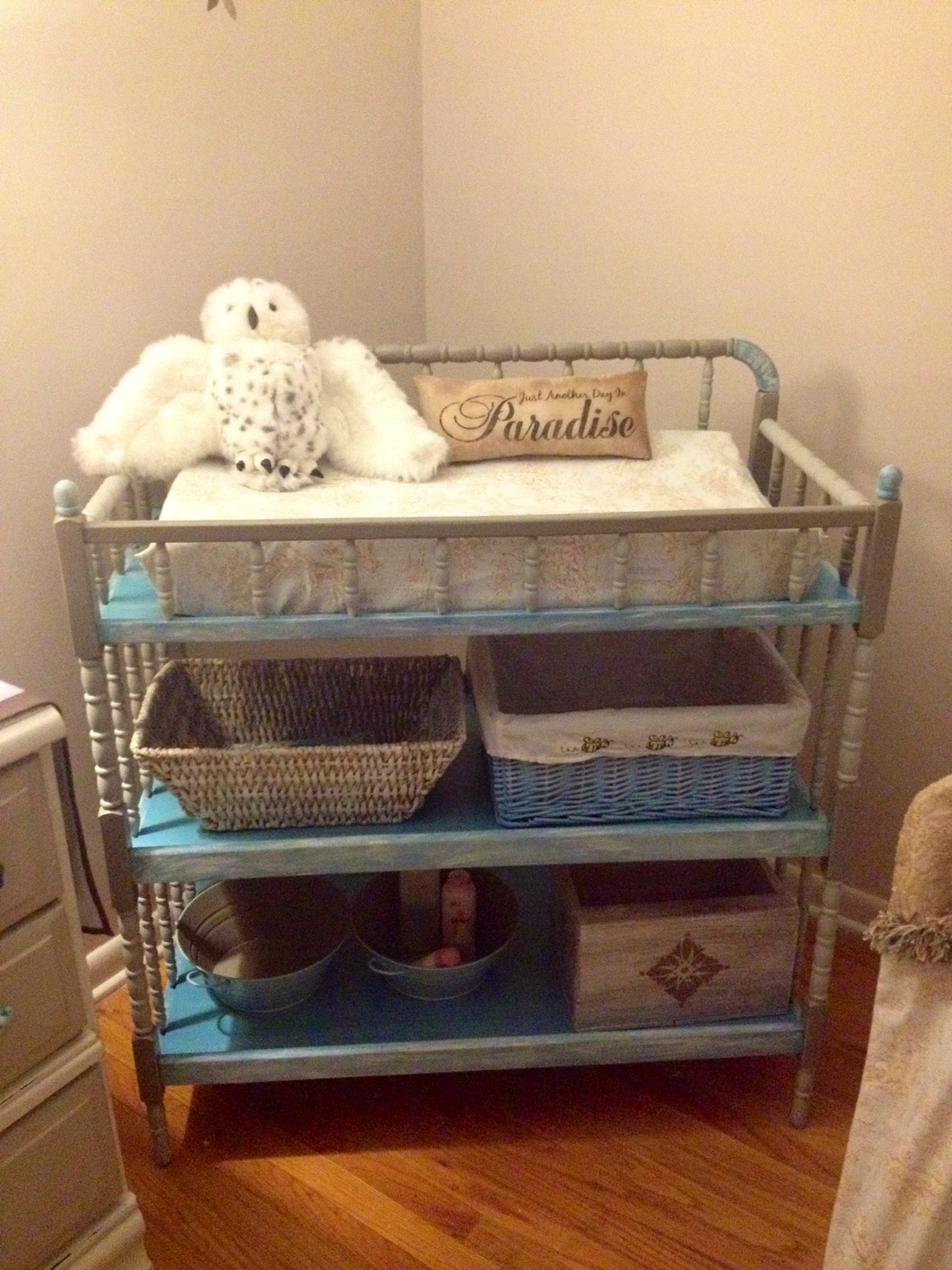
Every last accessory for it came from a thrift store, and one was gifted from a friend. The changing pad was also free!
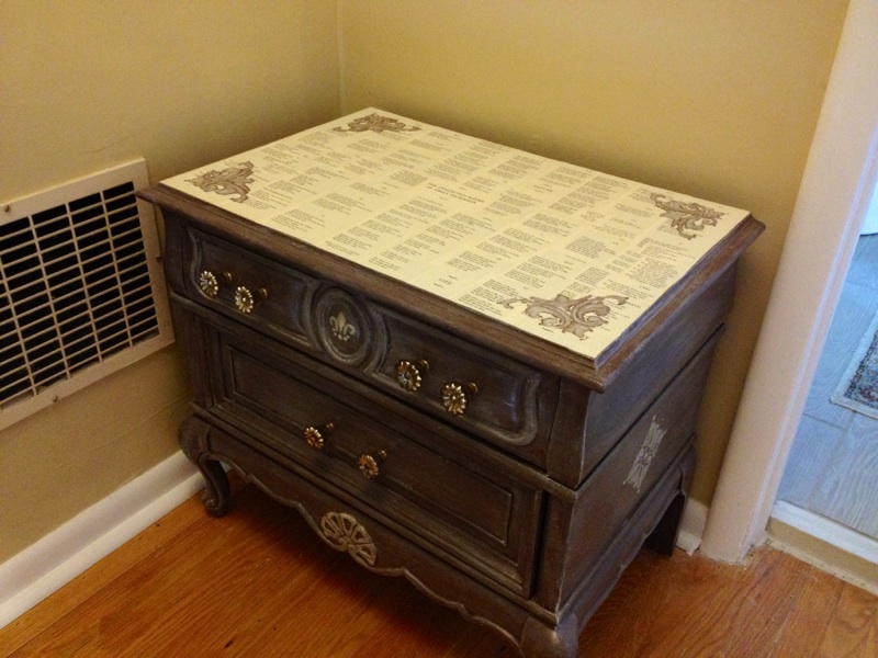
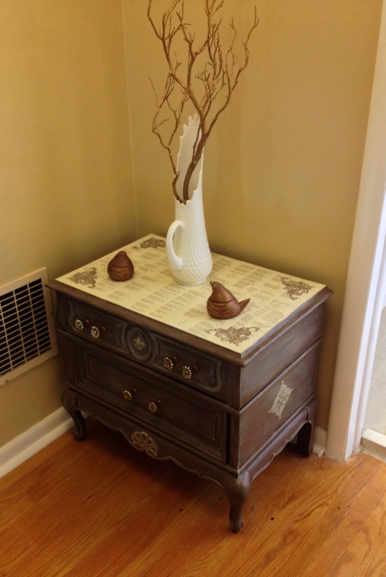
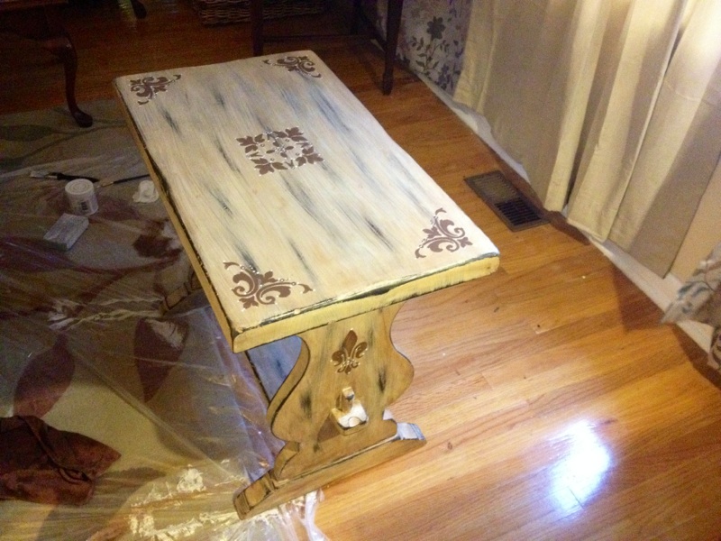
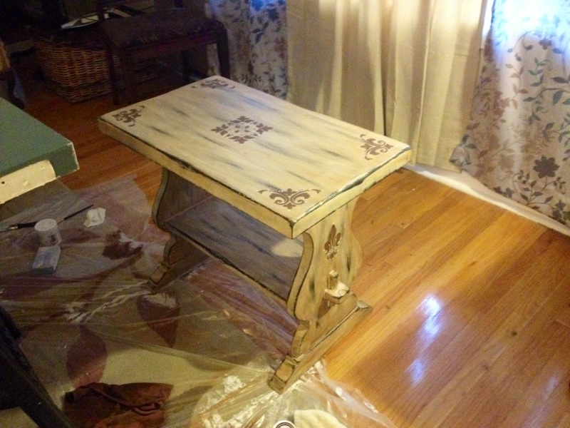
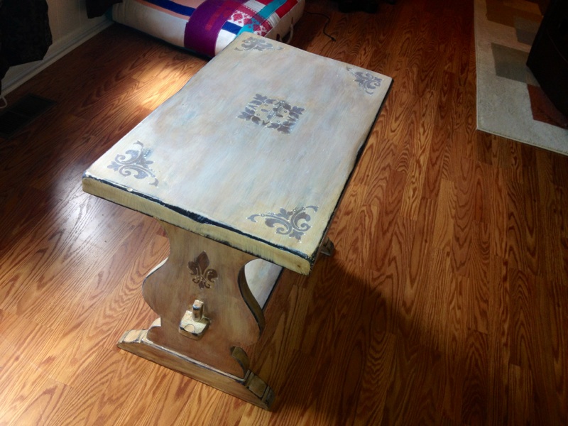
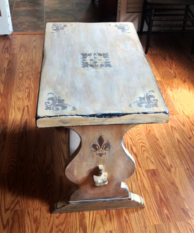
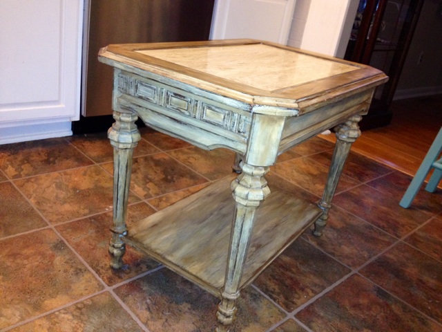
I was adamant that I needed a storage chest in the room for things like diapers, wipes, formula, bath items, etc. I found this $20 wood chest secondhand and painted it up:
What to do above the crib? An old, salvaged shutter solved that problem quickly. I decided that the name would be displayed on it close to her birth (since her name is a secret), and that a curtain rod and thrifted curtains would add an interesting element to the sides of the crib, framing it out. The result is a little unique, but one I am happy with:

After the crib, I set out to find either a nice, used bassinet or a cradle. I found a gorgeous white Jenny Lind style rocking cradle on Craigslist with eyelet bumper and pad for just $10! This will go in the master bedroom for her first couple weeks home so that she can room in with us:
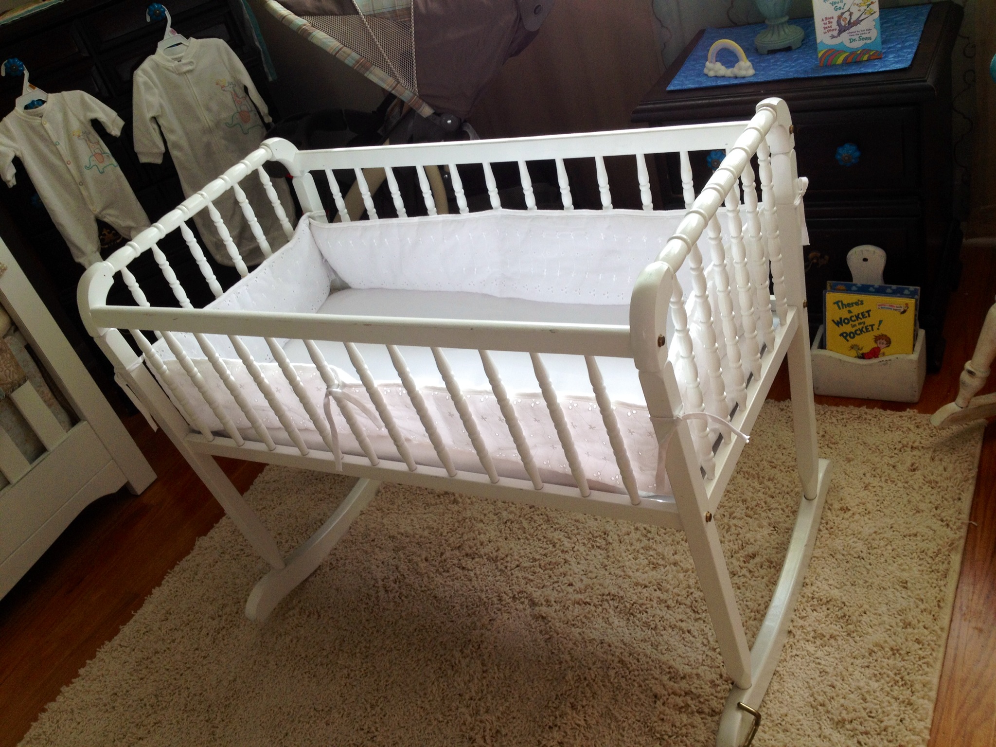
Again, I adore this vintage style, and it is extremely similar to a crib in design and feel, hopefully easing the transition later on!
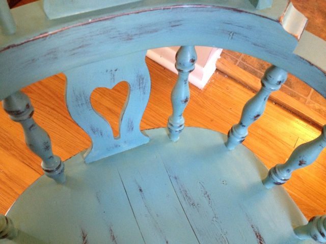
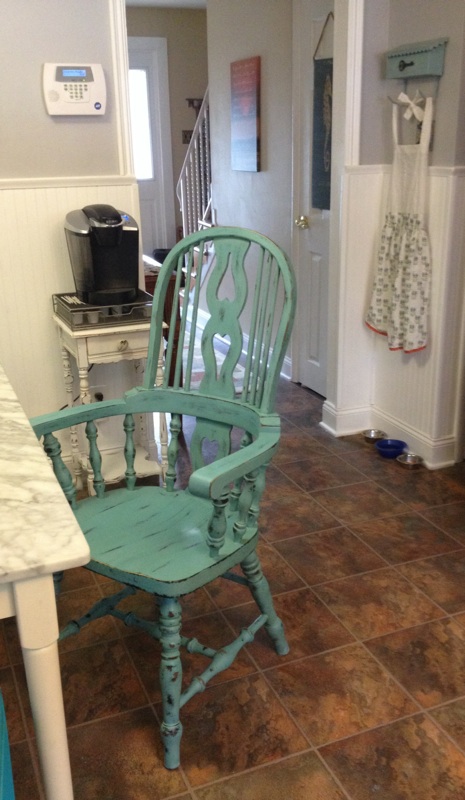
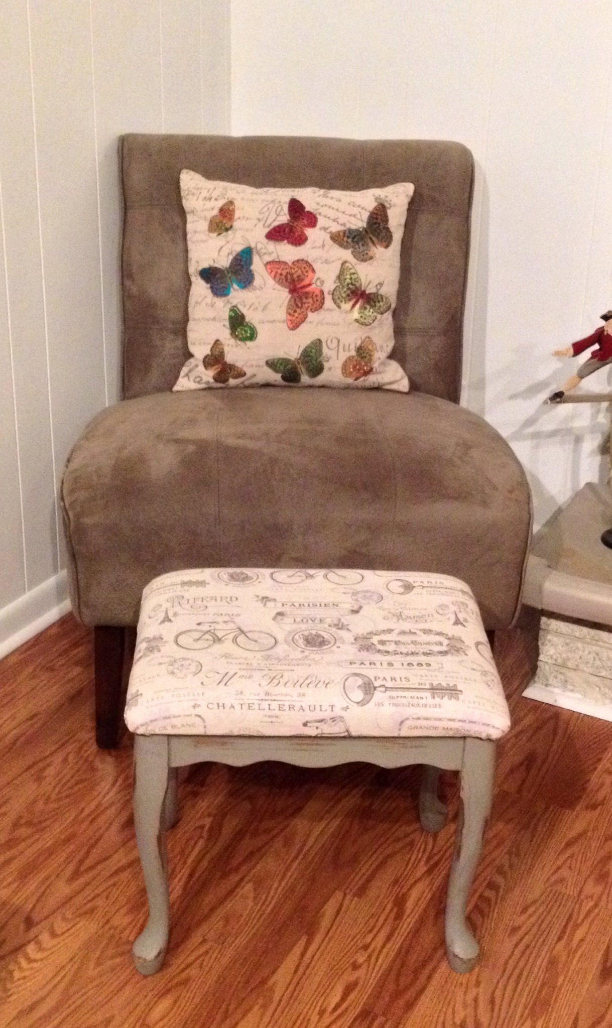
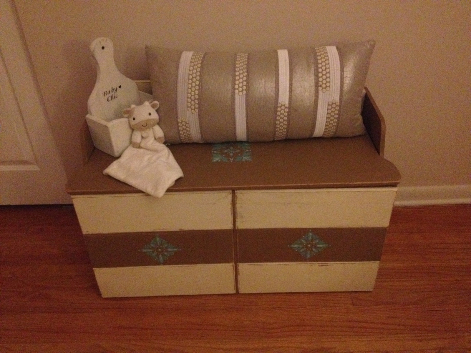
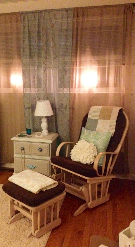
Next came a place to rock and feed the baby. After realizing a wooden rocker would not be comfortable enough, I decided to price out a glider and ottoman. THAT was a shock…with the least expensive coming in at close to $200 and going to up about $600. My problem was solved when a friend posted her old glider and ottoman for sale, that I was now the third owner of! It was covered in deep brown baby blanket fabric that wouldn’t show stains and had a pale wood frame that went with the room. She and her husband delivered it…cost just $35! After the addition of a $5 rose pillow (my daughter’s middle name) and a $3 turquoise geometric pillow cover, the look was complete:
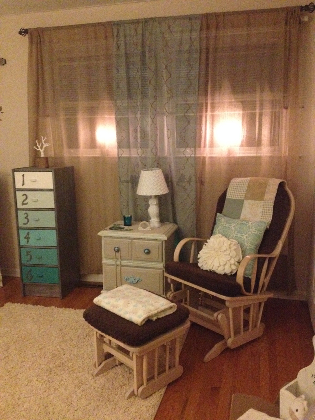
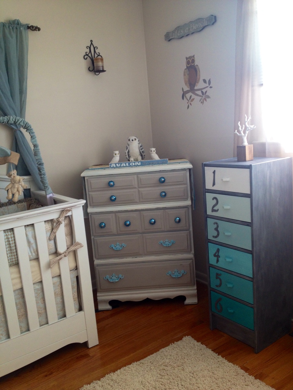
That ombre blue, numbered chest in the photo with zinc paint-job on the sides was a fun thrift-store makeover blogged in a previous entry. It fits in the nursery so well!
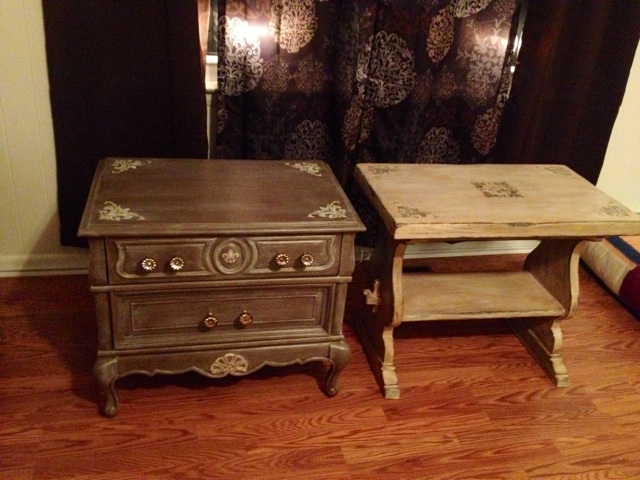
Next, and here was the doozy…is the furniture. My mom had graciously gifted us a set of dark pine furniture that had been in the family nearly 50 years, though it was in very rough shape. No drawers worked right, the wood was pitted and pocked in some spots, some hardware had broken, etc. But my brother used it growing up and it had sentimental value. I called around to furniture repair shops, but nobody wanted to take on such a small job (repairing all the drawer tracks). What did my husband do? Got out his tools and made them work again! The sides of the dressers and nightstand were a laminate as was a top layer, with the drawers being solid wood. Paint was the only solution. By now, we knew we were expecting a little girl, and I wanted something that could grow with her through the years, be neutral, and yet manage to be neutral and just girly enough. I decided on shabby, warm beachy white for the frames ,and a sand color for the drawers. The drawers also had a subtle crackle finish to add a nice textural detail and mimic wear/age. I kept the original pulls, painting them an aqua blue and highlighting them with white, and I found PERFECT turquoise blue mercury glass knobs for the top drawers. This total rehab was a major undertaking, one that was a lot for me to take on while pregnant and not feeling well. Still, at almost 30 weeks today, I am getting bigger and more achy/uncomfortable, so I needed to push through and get it done. Here is what I was working with before:

Simply too dark for a nursery, and in need of serious elbow grease. By the way, you should avoid regular paint while pregnant! I used Shabby Paints by Two Peas to rehab this furniture…acrylic-based, no VOCs, safe, non-toxic. After countless hours of work and painting, here is the end result:
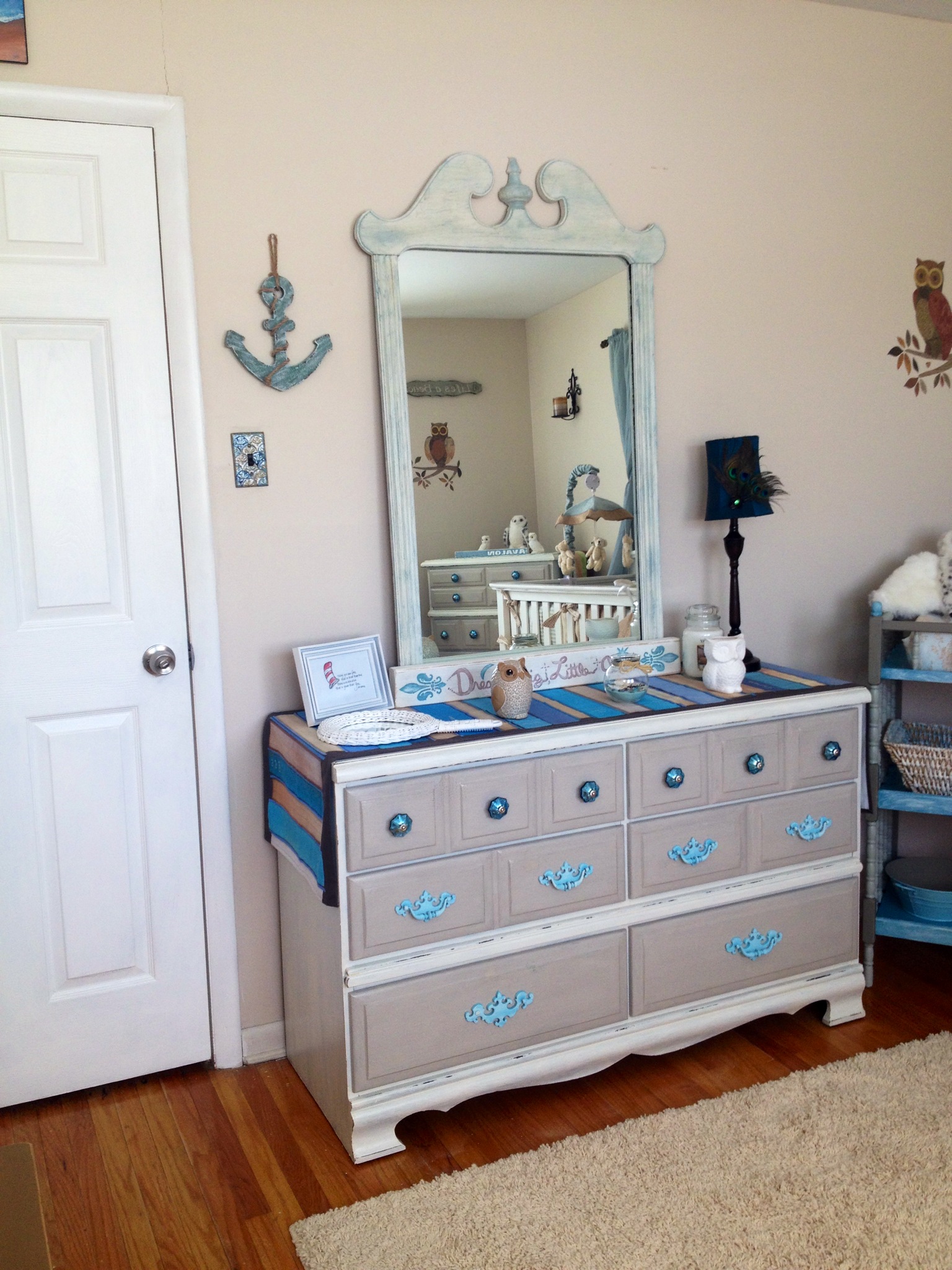
Perfect for a beachy/cottage nursery! And look at those great lines along the bottom…who knew they even existed?!
I did the same for the nightstand and high dresser and loved the results for both:


Next came a room-sized rug. I wanted a shag rug because I loved the texture, but most I saw were $150-$200. I found a 5 by 8 rug at Walmart on sale for just $68…and we love it! Photos of it are in the full-room shots at the end.
As for accessories, I re-purposed many things I already had, but added some great pieces to the wall that are special and fit the theme of the room. Here’s a taste:

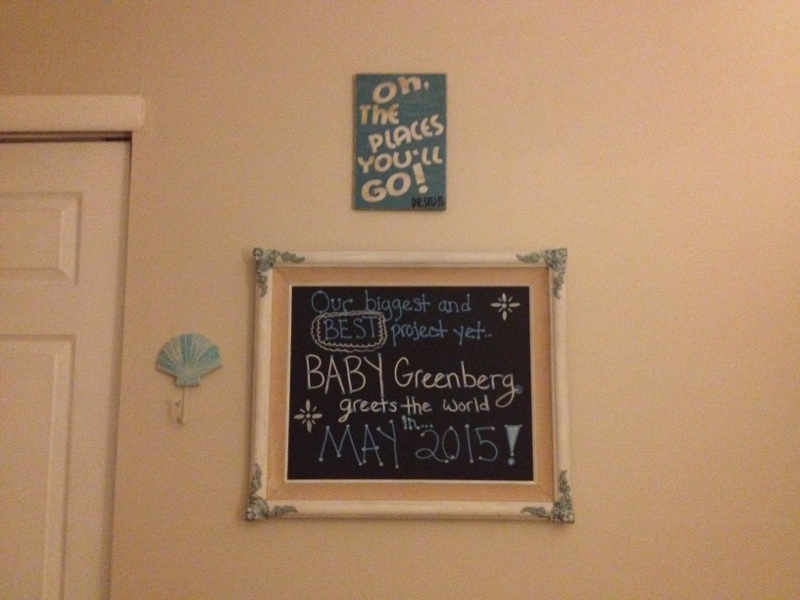


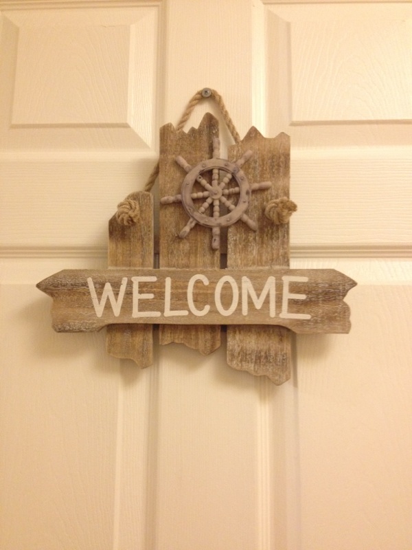

The wave painting is by me, just adding a beachy touch to her room. I shabby-painted the turquoise anchor hanging. The announcement chalkboard was a $4 thrift store frame I painted. The Dr. Seuss was made for me by an Etsy artist. The capiz shell mobile was bought over Valentine’s Day weekend in Cape May by us for just $10 (off-season). The other signs are perfect little inexpensive touches I found. I already had sconces and owl decals on the walls that I love and kept up.
I think it’s time for the finished photos, of everything put together. There’s hardly a single piece in this room that I have not rehabbed, painted, touched, enhanced, etc. I wouldn’t have it any other way!


I hope you love it as much as we do. We can’t wait for it to become “home” for our daughter. I hope that as she grows up, she appreciates having things that Mom worked so hard on for her, and that some of it even travels with her someday if she chooses to have her own family…
This room makes me so happy. I walk in all the time and it still manages to feel surreal.
Now, for one of the best parts…the cost breakdown! I will tell you that EVERY single thing you see in those photos add up to an amount that is almost silly. This nursery was entirely created on a budget of LESS THAN $500!!!
Nursery costs:
Glenna Jean bedding/accessories (bumper, crib skirt, sheet, diaper stacker, quilt, changing pad cover…$40 secondhand (regular price $567)
Baby Cache crib…$80 secondhand (regular price $400)
Vintage spindle-style changing table, refinished…free! (regular cost $50)
Changing table accessories…$7 total. (regular cost $20)
Baby mattress: $10, regular price $70
Shag rug…$68 (usually cost about $120)
Old vintage family furniture set: Dresser, mirror, highboy, nightstand…FREE and restored/painted. (Craigslist cost $400)
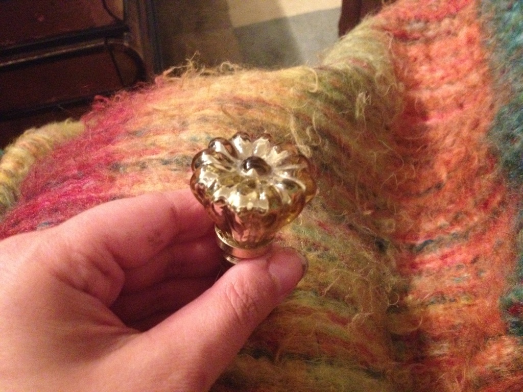
Mercury glass knobs/hardware: $10 after selling un-needed older hardware (regular cost $60)
Wood storage chest (painted): $20 secondhand (regular cost $60-70)
Jenny-Lind style cradle: $10 secondhand ($100)
Refinished ombre 6-drawer chest…$7 at thrift store…$20 total after supplies/materials ($75)
Vintage sandstone owl bookends: $8 (regular $20)
Owl lamp with ruffle shade…free/gifted by mom (regular $25)
Glider and ottoman, thirdhand/used…$35 (new one costs $199)
Rose pillow for glider: $5 (regular $15)
Geometric turquoise pillow for glider…$3 (regular $10)
Long pillow for storage chest: $19, Anthropologie (regular $50)
Welcome sign for door…$6 (regular $10)
“Life’s A Beach” sign…$4 (regular $10)
“Paradise” sign…$12 (regular $25)
Custom-made Dr. Seuss plaque from Etsy…$16
Wood anchor…$4.50 (regular $8)
Waves painting…free/painted by mom!
Thrifted mirror turned announcement chalkboard: $4 (buying something similar would run about $30)
New curtains: $17 (regular price $30)
Salvaged/painted shutter for behind crib: $12 (regular cost about $25)
Curtain rod for shutter: $8 (regular price $15)
Thrifted curtains for shutter: $2.50 for the set (regular price $10)
“To the moon and back” picture: $3
Paint/supplies: $50-60
$474 total for entire nursery, all items in it.
Should have cost: $2500+ with secondhand dressers.
Should have cost $3200+ with brand new or professionally repainted dressers.
Saved $2000-$3000, easily.
So there you have it…my baby’s beautiful nursery for less than $500! All that’s left is for May 18th to get here ❤